
Align 1 or some top level menu items to the right

Each top level menu item has a Align Menu Item to Right Edge option:

This option will float the menu item to the right side of the menu bar. Floating is necessary to separate some menu items to the left, and others to the right.
Right-floated order reversal
If you float multiple items to the right edge, their orders will be reversed (note this will not affect any menu items that are not right-floated). This is a natural and designed consequence of right-floating any HTML element. While left-floated elements stack left to right away from the left edge, right-floated elements float right-to-left away from the right edge. This is how “floating” works.
The visual order can be restored simply by swapping the menu item order in Appearance > Menus.
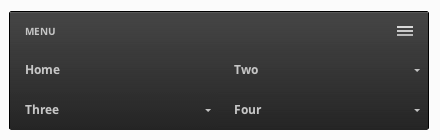
The two menu items on the right are floated right. Their order is reversed due to this.

Effect on responsive menu
However, note that when the menu collapses for mobile devices, right-floating no longer applies once the menu items stack. The upshot is that the visual order of the desktop menu will be reversed in the collapsed responsive menu if right-float the menu items.
Align the entire menu bar to the right
If you want to align the entire menu bar to the right, you can do so as described in the Menu Bar Positioning: Aligning Right guide.
Align all top level menu items to the right

If you want a full width menu bar, but all of your items aligned to the right, you can do that with text-align rather than floating.
#megaMenu.megaMenuHorizontal ul.megaMenu{
	text-align:right;
}
#megaMenu.megaMenuHorizontal ul.megaMenu > li.menu-item{
	float:none;
	vertical-align:top;
}
The submenu width will only be restricted by the menu bar length, you will not need to reverse any item orders, and the responsive menu order will remain the same.