
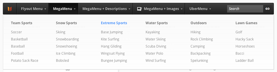
Unlike other responsive systems, UberMenu uses a single set of menu items that are displayed at all sizes. Using CSS, the menu format adapts to the various device widths to present a quality navigation experience as the viewport resizes.
Breakpoints
> 960px
Approximate device size: Full Size Monitor or Horizontal Tablet/iPad
Target Media Query
@media only screen and (min-width: 960px){

}
767px – 960px
Approximate device size: Vertical Tablet/iPad

Any menu items that don’t fit on the top level will automatically wrap to a second row. Submenus still accessible as normal.
Target Media Query
@media only screen and (max-width: 960px){

}
480px – 767px
Approximate device size: Horizontal Phone/iPod
Below 767px, the menu collapses to a single bar that can be clicked/tapped to expand the submenu items.
Default state

Expanded state
Top level menu items will be laid out from left to right, top to bottom, with two menu items on each row.

Submenu open state

Target Media Query
@media only screen and (min-width: 480px) and (max-width: 767px) {

}
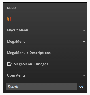
< 480px
Approximate device size: Vertical Phone/iPod
Below 480px, the menu collapses further and top level menu items will each take up an entire row.
Default state

Expanded state
Submenu open state

Target Media Query
@media only screen and (max-width: 479px){

}