
This is the menu bar:

When we refer to the menu bar, we’re referring to the container that wraps the top level menu items; not the submenu or any individual menu item.
Menu Bar Width
The menu bar has two modes that affect its width:
Full Width Mode
When Expand Menu Bar Full Width is activated (as it is by default), UberMenu will expand to 100% of its container element. The container element is defined by the theme. If the theme has defined the container element to be 50% of the inner width of the page, UberMenu will expand to 50% of the inner width of the page. If the theme has not defined a width in the containers surrounding UberMenu, it will expand to the edges of the viewport.
These constraints are set entirely by the theme and are not controlled by UberMenu
Note that UberMenu cannot expand beyond the width of its container, so if the width of your menu bar seems limited, you should check the container defined by the theme.
Remember, if you have Full Width Mode enabled, aligning the menu to the left or right will make no difference, as the menu takes up the full width of its container and is already aligned with both extents
Natural width mode
If you disable Expand Menu Bar Full Width, the menu bar will automatically size to the width of the top level menu items. That is, there won’t be any extra space on either side of the first and last menu items.
It is important to realize that the maximum width of the mega menu submenus is restricted to the width of the menu bar. If your menu bar is too narrow, your submenu columns will automatically stack if there is not enough horizontal real estate to accommodate them.
Menu Bar Positioning
Theme Container
The position of the menu bar is dictated by the theme’s container. Under normal circumstances, UberMenu will appear in the same location as the standard theme menu.
To change the position of the menu, a PHP edit, a CSS edit, or both may be required.
Misplaced menus
If you activate UberMenu and the menu is no longer located where the original theme menu was located (for example, if the menu used to be below the logo but now it is above), it is likely that your theme’s header elements are positioned absolutely. There’s no way for UberMenu to predict this, and since elements are positioned relatively by default, UberMenu will float to the top of the absolutely positioned elements.
The solution is position UberMenu absolutely as well. Generally the easiest solution is to find the old positioning code from the theme and apply it to UberMenu. For example, the original menu may have been positioned like this:
.nav{
  position:absolute;
  top:50px;
  right:0;
}
To properly position UberMenu, you’d add code like this:
#megaMenu{
  position:absolute;
  top:50px;
  right:0;
}
Centering
There are three types of “centering” – be sure to pick which one you mean: the entire menu bar, the inner menu bar, or the menu items.
Centering the (entire) menu bar
If you want to center the menu bar, you can do so in the Control Panel. Sometimes this is necessary if when UberMenu replaces your theme menu it expands the full width of the window, and you mean to keep it within the bounds of your content area.

- Navigate to Appearance > UberMenu > Advanced Settings
- Set the Menu Bar Width to the width of your content (or other desired width). 960px is a common width.
- Enable Center Menu Bar.
- Enable Enable Clearfix if it is not already on
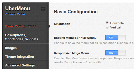
- Don’t forget to disable the Expand Menu Bar Full Width option in Appearance > UberMenu > Basic Configuration.
- Save your settings
Your menu bar should now be centered.
Centering the inner menu bar
Sometimes, you want the menu bar to span the entire width of your window, but the menu items should be bound within the extents of the site content.

Note that to have the menu bar expand the full width of the window, its parent element must be the full width of the window. The menu bar cannot be wider than its container element.
- Navigate to Appearance > UberMenu
- In the Basic Configuration panel, activate Expand Menu Bar Full Width
- In the Advanced Settings panel, leave Menu Bar Width empty, and disable Center Menu Bar
- Enable Enable Clearfix
- Set the Inner Menu Width to the width of your site content. 960 is a common width
- Enable Center Inner Menu
Your inner menu bar should now be centered to your content.
Centering the items themselves within the menu bar
If you want the menu items themselves to be centered (as opposed to their container), you can easily do this in the Control Panel > Advanced Settings > Center Menu Items
Please note that if you center the menu items themselves, you may induce formatting issues with advanced features like top level images, widgets or shortcodes. This is due to the necessary change in display properties required in order to center the menu items. You may need to use custom CSS to align your menu elements as desired
You may want to add styles like this
#megaMenu.megaCenterMenuItems ul.megaMenu > li.menu-item{
  vertical-align:middle;
}
Aligning Right
If you want to position your menu bar to the right of the layout, you can add this CSS to float it to the right:
#megaMenu{
    float:right;
}
Also be sure to disable the Expand Menu Bar Full Width option in the UberMenu Control Panel. If the menu bar is full-width, floating it will not make it less than full width
Remember that your submenus can only be as wide as your top level menu bar by default.
If you need to expand your submenus wider than your menu bar, see Submenu Widths: Extended Width
It’s important to note that if your submenu is too narrow (as restricted by your menu bar), you may force your submenu columns to stack because they do not have enough horizontal space to fit two to a row