
Out of the box, the width of a mega submenu can be determined either naturally (based on the width of its contents) or set to full width. Each submenu can be sized independently.
Natural (sized-to-content)
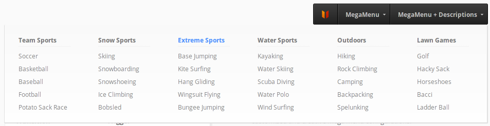
Naturally sized submenus are the default. That means that the width of the submenu container will be based upon the width of the columns within that container. This is a naturally sized submenu:

The submenu is only as wide as the items inside it.
To use natural width submenus, turn on jQuery Enhancements (it’s enabled by default), and don’t check “Full Width Submenu” on your top level menu item. In other words, your submenus will be sized naturally if you don’t make any changes to the settings.
Note: Natural width submenus are only valid for jQuery Enhanced menus – without jQuery, the submenu cannot be centered, which can result in accessibility issues, so the menu will be set to full-width automatically
Full Width
A full width submenu will span the entire width of the menu bar – no more and no less. Here is an example of a full width submenu.

Note that the submenu would still be that wide even if there were only two second level menu items (columns).
You can make any submenu full width by checking the Full Width Submenu checkbox on the top level menu item

Note that if you are using full width submenus, you can set the number of columns per row explicitly.
You can also set all your submenus to be full width automatically via the UberMenu Control Panel > Basic Configuration. This will override individual submenu settings.

It’s important to note that if your submenu is too narrow (as restricted by your menu bar), you may force your submenu columns to stack because they do not have enough horizontal space to fit two to a row
Extended Width
Whether you are using natural or full width submenus, your submenus will never expand beyond the width of the menu bar out of the box.
Why is this? The submenu width has to be bounded somehow, otherwise it could conceivably extend beyond your content area and off the edge of the viewport, causing major user experience issues.
Sometimes, however, you want the submenu to extend beyond the width of the menu bar. The most common scenario is that you have a narrow menu bar aligned to the right of your header, and you want the submenu to be able to extend beyond the left edge of the menu bar. Here’s an example of the desired outcome:
In this case, we can explicitly set the width of the submenu to be wider than the menu bar with some custom CSS.
- For submenus that you’d like to expand, select Full Width Submenu on the top level menu item.
- Then, set the submenu alignment Right (optional, or set left depending on your situation).
- Next, add this code to expand the submenu beyond the width of the menu bar:
#megaMenu.megaMenuHorizontal ul.megaMenu > li.menu-item.ss-nav-menu-mega-fullWidth > ul.sub-menu.sub-menu-1{ width:940px !important; /* Adjust as desired */ max-width:none !important; } - Alternatively, you can set the left or right values manually (rather than setting the alignment):
#megaMenu.megaMenuHorizontal ul.megaMenu > li.menu-item.ss-nav-menu-mega-fullWidth > ul.sub-menu.sub-menu-1{ width:940px !important; max-width:none !important; right:0; left:auto !important; } - If your site is responsive, you will want to add some media queries to handle the submenu widths when your window is less than 940px, for example. One way to do this would be to wrap the code above in a media query:
@media only screen and (min-width: 960px){
    #megaMenu.megaMenuHorizontal ul.megaMenu > li.menu-item.ss-nav-menu-mega-fullWidth > ul.sub-menu.sub-menu-1{
        width:940px !important;
        max-width:none !important;
    }
}
Alternatively, you can add media queries for various sizes and adjust the width of the submenu manually. How you accomplish this is totally up to you and dependent on your site and goals.
Static Width Submenus
If you wish to set a static width for your submenus, this is as simple as adding some Custom CSS. Just find the ID of the submenu’s parent item, and set the width:
#megaMenu ul.megaMenu > li#menu-item-100 > ul.sub-menu{
   width:300px;
}
Generally it is better to leave your submenus at flexible (non static) widths, sized to their contents, for maximum responsiveness.