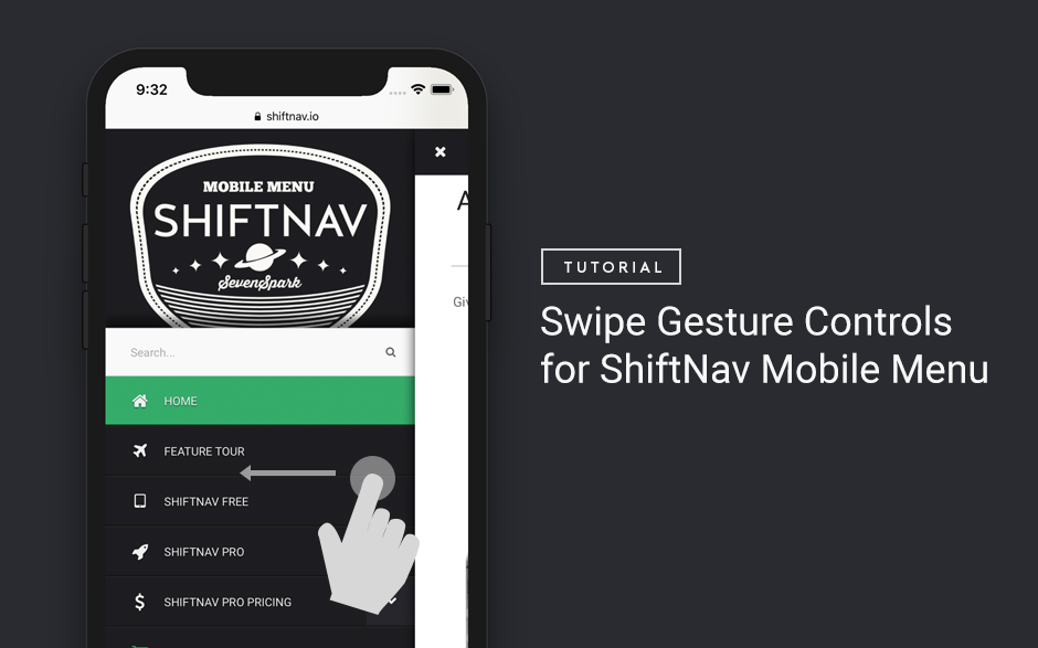
Hiding menu items or submenus for responsive / mobile or desktop

Menu Item Settings > Responsive If you have menu items that should only be displayed on mobile (or only on desktop), there are two ways to accomplish that through the UberMenu Menu Item Settings, under the Responsive Tab. Hiding a menu item Hiding a menu item means that it will be hidden from view with CSS, but it will still be present in the markup. Whether the item is hidden or not depends on the viewport width. The advantage to hiding over disabling, is that the menu items will appear and disappear as users resize their viewports or rotate devices. The disadvantage is that the markup will always be present, and therefore that data will still be transferred to mobile users. Disabling a menu item Disabling a menu item means that the item will not be present in the markup at all. Whether the item is disabled or not depends on the type of device (determined with wp_is_mobile() ). The advantage of disabling over hiding is that it will save your mobile users some bandwidth. The disadvantage is that if you are using caching and you don’t have a separate cache for mobile and desktop users, you cache can serve up the wrong version of the menu. Also, the wp_is_mobile() function uses server-side browser detection to determine whether a user is on a mobile device or not, which is not 100% reliable. Disabling a submenu If you would like to disable an entire submenu, you can do that as well. Note that the same disadvantages/warnings apply as with disabling a menu item. If you check “Disable submenu on mobile” on a specific item, it will disable that item’s submenu. Note that you can’t simply hide a submenu below a breakpoint with CSS. If you did, the submenu would still be […]

Mobile & Responsive

UberMenu implements a single-menu responsive solution. Below 960px, the menu collapses into a menu toggle which can be clicked to reveal the menu items. UberMenu remains full-size on larger devices like horizontally-oriented iPads. UberMenu Responsive & Mobile Articles Read the articles below for information on the default breakpoints, using UberMenu on mobile, strategies for hiding menu items at different resolutions, and troubleshooting themes with existing responsive menus. Alternatives If you would rather use a separate menu for your mobile menu, we provide a dedicated mobile menu option called ShiftNav. ShiftNav Adds an off-canvas mobile menu on mobile devices, compatible with UberMenu.

ShiftNav – Responsive Mobile Menu

If you’d rather replace UberMenu on your mobile device with an off-canvas responsive mobile menu, you can install ShiftNav to do just that.

If UberMenu replaces your responsive menu but not your main menu

With some themes, UberMenu may replace only the theme’s responsive or mobile menu, but the main menu remains unchanged. This happens when the theme calls wp_nav_menu twice with the same theme_location. As a result, UberMenu is only applied to the first instance of the theme location, and if the mobile menu is printed first by the theme, only the mobile menu will be affected. Any changes you make to your theme should be done in a child theme. Generally this just means copying over the header.php and modifying it accordingly. Many themes already include a starter child theme for you. Note that if you just want to use UberMenu as both your main and mobile menu, simply remove the wp_nav_menu call for the mobile menu. UberMenu only needs one instance to be responsive. If you want to maintain your theme’s mobile/responsive menu but use UberMenu as your main menu, the solution is to separate these two menus with two different theme locations. Changing the Theme Location Instance (UberMenu 2.4.0.1) As of UberMenu v2.4.0.1, UberMenu offers a “Theme Location Instance” setting, so you can tell UberMenu to target the second instance of a theme location rather than the first. So if UberMenu is replacing your mobile menu, but you want it to replace your desktop menu, try changing this value to 2 in your Advanced Settings For many cases, this will be all you need to do. However, in certain cases you may need to separate the theme locations manually. Proceed to the next section if this doesn’t work, for example: If you are using multiple UberMenus, this instance value will apply to all of them; so if some of your theme locations need instance 1 and others need instance 2, you’ll need to sort that out via templates (as shown […]

Responsive & Mobile

This article is for UberMenu 2. If you are using UberMenu 3, please check out the UberMenu 3 Knowledgebase: Mobile & Responsive UberMenu implements a single-menu responsive solution. At 767px (the standard breakpoint for mobile devices), the menu collapses into a menu toggle which can be clicked to reveal the menu items. UberMenu remains full-size on larger devices like iPads. UberMenu Responsive & Mobile Contents Read the articles below for information on the standard breakpoints, using UberMenu with Android & iOS, strategies for hiding menu items at different resolutions, and troubleshooting themes with existing responsive menus. Alternatives If you would rather use a separate menu for your mobile menu, there are two options at your disposal: 1. ShiftNav Adds an off-canvas mobile menu on mobile devices, compatible with UberMenu. 2. Responsive Select Menu The Responsive Select Menu plugin offers a different paradigm for handling responsive menu functionality, by collapsing the menu to a selectbox on mobile devices. It is compatible with UberMenu.

How can I change the responsive breakpoints?

UberMenu 3 supports Custom Breakpoints. Please consider updating to UberMenu 3 (don’t forget to read the migration guide!) if you would like to change your breakpoint. Please note that this is a general overview/guide for advanced users who want to customize their responsive break points; UberMenu 2 does not support breakpoint adjustments out of the box Out of the box, UberMenu responsive breakpoints are fixed at the de facto standards of 960, 767, and 480 pixels, as described here: UberMenu Responsiveness These breakpoints are built into the basic.css, as making these values configurable would require printing a large amount of CSS in the site head. Therefore, adjusting these breakpoints requires altering the basic.css. As you know from the Customizing UberMenu section of the guide, you should never edit any UberMenu core files. Therefore the strategy to alter these breakpoints will be to: Disable the default basic.css in the UberMenu Control Panel > Advanced Settings Include a customized version of basic.css in your custom.css file Since we’re playing with the core styles, any time you update UberMenu you’re going to have to do a little extra maintenance to maintain your customizations. There’s an low maintenance way and high maintenance way to do this. We’ll cover the high maintenance strategy first. High Maintenance Route – Edit basic.css Of course, we can always just edit the CSS files directly. Copy the basic.css and your skin preset into your custom.css. Edit the media queries in basic.css to your desired breakpoints. Switch your Style Application to Custom and you’re good to go! The problem with this method is that when there is an update and basic.css changes, you’re going to need to update your customized basic.css manually. Low Maintenance Route – LESS Please note that you should be familiar with LESS to use this section; […]

Conflict with theme’s responsive menu

Many responsive themes use the “responsive select menu” paradigm to display their responsive menus. This means that the theme actually prints two menus, and uses CSS media queries to only display one at a time. By calling wp_nav_menu twice with the same theme_location parameter, the theme produces two menus, only one of which will become an UberMenu. The second is now superfluous. Here’s what the setup usually looks like: Several situations may arise, depending on how the theme has setup its responsiveness: Both menus may be displayed at small sizes UberMenu may be hidden by the theme at small sizes UberMenu may be hidden at full size You have three options to resolve this: 1. Using only UberMenu UberMenu is already responsive, and does not require an additional menu. If you wish to use UberMenu’s responsive capabilities, you’ll need to find the secondary (responsive) wp_nav_menu call (normally in your theme’s header.php), and remove it. Now you’ll have a single menu controlled entirely by UberMenu. Be sure to remove any residual styling (see also: residual styling troubleshooting guide) in the process. 2. Using UberMenu with the theme’s responsive menu If you want to use UberMenu for wider screens and the theme’s responsive menu for mobile devices, you’ll need to do two things: If your responsive menu is printed first, and you aren’t getting an UberMenu at all due to the wp_nav_menu function being called twice with the same theme_location parameter, replace the wide-screen wp_nav_menu call with UberMenu Easy Integration. This creates a separate theme_location (called “UberMenu”), which we will activate – and then deactivate the theme’s standard theme_location. You’ll then (likely) need to apply CSS to hide UberMenu ( #megaMenu{ display: none; } or .main-menu-standard{ display: none; } ) for the appropriate size/media query. This will vary based on your theme, […]

iOS Video overlapping unresponsive menu issues

If your videos are dynamically created and inserted (with javascript, for instance), and they overlap an UberMenu submenu (or any content on your page) iOS won’t handle that nicely – the overlapped content will become unresponsive after you activate/play the video. Unfortunately, there is nothing to be done from an UberMenu standpoint – this is an issue with the way iOS handles dynamically inserted Flash objects and overlapping HTML elements. Here are some potential solutions for the issue – your mileage may vary: Potential Solution #1 Getting embedded Youtube videos to stay under your drop down menu – even with an iPad – if you are using embed code, this may work – just like the wmode fix presented above. Potential Solution #2 This Stack Overflow answer explains the dynamic insertion issue (see the answer with 18+ votes) : This solution has worked for some people, depending on the situation You can fix z-index on dynamically created videos by giving the video element -webkit-transform-style: preserve-3d Potential Solution #3 If your videos are dynamically inserted, insert them statically instead. The issue seems to only occur with dynamically inserted videos, based on reports. Potential Solution #4 If all else fails, you could write some javascript that will hide the video when UberMenu is in the hover state. Something like: But even this may introduce its own issues in iOS. Until iOS Safari becomes a more robust browser, this may simply be a limitation of having videos on your site If none of the above solutions work for you, unfortunately this issue seems unresolvable for the time being. This issue is due to the way mobile Safari handles video elements and focus layering. Until Apple resolves the issue with mobile Safari, there is no solution to my knowledge.