How to add a WooCommerce cart widget to your mega menu dropdown

How to add a cart widget to your menu This tutorial shows you how to add a submenu to your Cart Summary / Info item which displays a mini cart. Please note that the styling of your WooCommerce cart widget will be dictated by WooCommerce and your theme (if your theme provides cart widget styles. UberMenu does not apply its own styling to the cart widget 1. Add a Widget Area item as a child of your Cart Summary item In Appearance > Menus, add a new Widget Area item from the UberMenu Advanced Items group. Drag it into position as a child below your top level cart summary item. 2. Set up the Widget Area In your new Widget Area item, open the UberMenu settings and enter the name for your widget area in the Custom Widget Area setting. We’ll use Cart Click Save Menu Item to save the UberMenu item settings. Click Save Menu to save the new menu item to the menu – or you can do this later after you’ve set up the Widget in Step 3. 3. Add the widget Navigate to Appearance > Widgets in your WordPress admin. Find the Cart Widget Drag it into the [UberMenu] Cart widget area You can remove the title to just show the cart with no header above it if you like. Click Save to save the widget. 4. Set the submenu position and width, disable the submenu indicator (optional) Back in Appearance > Menus, Open the UberMenu menu item settings for the top level (Cart summary) item In the General tab, enable the Disable Submenu Indicator setting. In the Submenu tab, set the Mega Submenu Position to Right Edge of Parent Item or as desired. In the Submenu tab, set the Submenu Width to 450px or as […]

How can I use dropdowns inside my mega submenus?

By default, your normal items within a mega submenu will be visible when the submenu is opened. By leaving the Submenu Type set to “Auto”, these column items become stacks. If you switch the Submenu Type to Mega or Flyout, you will get a dropdown instead, and this article deals with that situation. Flyouts within Mega Submenus are not recommended I do not generally recommend using dropdowns within mega submenus. This is generally confusing for users and leads to bad UX, so you should consider whether this is really the best format for your submenu. Generally, better formats would include using Tabs or else Flyout submenus as your first level and mega submenus as your second level. These formats achieve similar effects (hidden content revealed on activation within a submenu) in a more structured format. Enabling Dropdowns within Mega Submenus If you wish to allow dropdowns within a mega submenu, you can enable that in the Control Panel > Main UberMenu Configuration > Submenus > Allow Dropdown within Mega Submenu Please note: if you enable this setting, you cannot use the “Slide” submenu transition. This is because the slide transition requires hidden overflow to work, while dropdowns within mega submenus requires visible overflow to work. If you want to use this setting, you must switch to a Transition other than Slide Multi-level mega submenus (intended use case) One good use (really the intended one) for this is to allow a single-line submenu to have additional mega submenus so that you can have a double-level mega menu. This is a very specific scenario, however. Here’s the result when using the setting as intended:

Image Portal (Experimental)

This feature is experimental. Its implementation may change in the future An Image Portal allows you to display an item’s image, on hover, in a separate area of the menu. The Portal is the area which displays the images separately from the source items. Note that in the Portal setup, the images will not be clickable, as they will disappear when hovering off of the associated menu items. Setup Instructions Overview We’ll set up a group of menu items with images assigned. Then we’ll add a custom content item elsewhere in the layout, containing the [ubermenu_image_portal] shortcode, which will select those menu items and display their images when hovered. 1. Create a list of menu items First, create your list of items. These items will trigger an associated image to appear in the Portal when you hover over them. You can put them in whatever layout you like (multiple columns, rows, etc), however, none of the items should have dropdown submenus, as the dropdown trigger mouse interaction would conflict with the image hover mouse interaction. 2. Apply an image to each item You can set an Image for each item, either manually or by inheriting the featured image from that post. Make sure you set the Item Layout for the items to “Image Above”, either on the item itself or in the Control Panel (global settings). These images will be collected and removed from the source menu items and displayed in the Portal instead. (For now, you’ll see them with the items, but that’ll change once we add the shortcode in step 4). 3. Give your item source container a selector When we create the actual Portal, we’ll give it a standard CSS/JS selector to indicate which items’ images should be displayed in the portal. You can set this up […]

Twenty Twenty One

Twenty Twenty One will create residual styling on mobile by wrapping UberMenu inside its own menu, and add +/- buttons within the menu items which break the menu layout. To resolve this, we will use manual integration to replace the theme’s menu with UberMenu, and remove the theme’s toggle button filter via a child theme. Manual Integration & Button removal 1. Set up your child theme If you haven’t already, install and activate your child theme. We will make changes here to preserve them when the parent theme is updated. If you are not sure how to create a child theme, the Child Theme Configurator plugin is an easy way to generate one. 2. Copy the site-nav.php template into the child theme In the child theme, create the following folder structure: template-parts/header Copy the template-parts/header/site-nav.php file from the parent theme into the same directory in the child theme. 3. Edit the nav template Open the site-nav.php file that you just created in the child theme. We’ll conditionally replace the entire #site-navigation block with the UberMenu manual integration code, like this: 4. Remove the toggle buttons filter Twenty Twenty One injects extra markup into *every* menu to add the +/- buttons via a filter. Remove them by adding this PHP in your child theme’s functions.php file: Recommended Settings Menu Alignment To align the menu to the right of the site title, set the Menu Bar Alignment to Right in the Control Panel. Because the theme uses a flexbox header, you may wish to add this CSS to align the menu to the right edge of the content area: You may also wish to set the Bound Submenu To setting to Unbounded to allow the submenu to expand beyond the width of the menu bar. To bound the submenu to the theme’s […]

Mobile Submenu Type

Since UberMenu 3.7 Dropdown submenus By default, submenus on mobile will drop down, meaning that when they are open they will overlap other content in the menu/site. This is generally preferable for inline menus, which displace other content on the site when they open. Using dropdowns limits the scrolling required to navigate the menu. Accordion submenus Accordion submenus are a new option in v3.7 to complement the Modal Mobile menu. Accordion submenus push down items below them rather than overlapping. This option is optimized for the Modal mobile menu option, which appears in its own modal window and scroll context. Note that if you use a 2-column layout for tablets, accordion mode will be disabled as this is incompatible.

Twenty Nineteen

Twenty Nineteen interferes with UberMenu in two ways: 1. Injecting markup through PHP filters, which is resolved through a snippet of code provided below. 2. Residual styling, which is resolved through manual integration and a line of CSS. Are you using a child theme? You should always use a child theme to modify your theme and never edit the parent theme itself. If you’re not already using a child theme, create one first and activate it. If you’re not sure how to create a child theme, you can use the Child Theme Configurator plugin to automate the task. Don’t forget to activate your child theme. It doesn’t do anything unless it’s the active theme. Removing extra Twenty Nineteen markup The most obvious issue when integrating UberMenu with Twenty Nineteen is the extra markup that the theme injects, so we’ll tackle that first. All of these extra arrows (among other markup) are added by Twenty Nineteen. While these are important for Twenty Nineteen’s menu, the theme adds this extra markup to *all* menus, rather than just its own. To prevent Twenty Nineteen from adding this extra markup to UberMenu, add this PHP code in your child theme’s functions.php Eliminating Residual Styling Next we want to prevent the theme’s styles from interfering with the menu. To do this we’ll use manual integration. First, copy the twentynineteen/template-parts/header/site-branding.php into your child theme in the same directory (you’ll need to create those directories if they don’t already exist). e.g. twentynineteenchild/template-parts/header/site-branding.php Next, open the child theme’s site-branding.php file and find the #site-navigation section: Replace this block of code: with this: That manually integrates the menu. Finally, there is still some CSS from the theme that gives the text in the menu a shadow – it applies to all text within the header. To disable this, add […]

WooCommerce

UberMenu supports WooCommerce Product and Product Category menu items, and includes the ability to add cart summary and mini cart widget to your menu. Basic Menu Item Compatibility UberMenu has standard WooCommerce compatibility – you can add Products and Product category menu items to your mega menu. If they do not appear by default, you can activate them in your Appearance > Menus > Screen Options: and they will appear in the sidebar: These items function the same as any other item in your menu. Featured Images Featured images are supported both for static items and dynamic items. Products You can use the Dynamic Featured Image Inheritance feature to automatically display the featured image for the product. Product Categories As of UberMenu v3.7, the featured images functionality also supports WooCommerce Product Category images. WooCommerce Item Layouts There are two WooCommerce item layout options that will display the price and product image. Dynamically display WooCommerce Products and Product Categories In addition to adding static items as shown above, you can use Dynamic Terms to display WooCommerce Product Categories and Dynamic Posts to display WooCommerce Products dynamically. Cart Info/Summary Since UberMenu 3.5 You can add a cart summary (item count and total price) via the [ubermenu_woocommerce_cart_info] shortcode. Learn more about How to add a cart summary info item to your menu Cart Widget Dropdown You can display a mini cart in your submenu via the WooCommerce cart widget. Learn more about How to add a WooCommerce cart widget to your mega menu dropdown

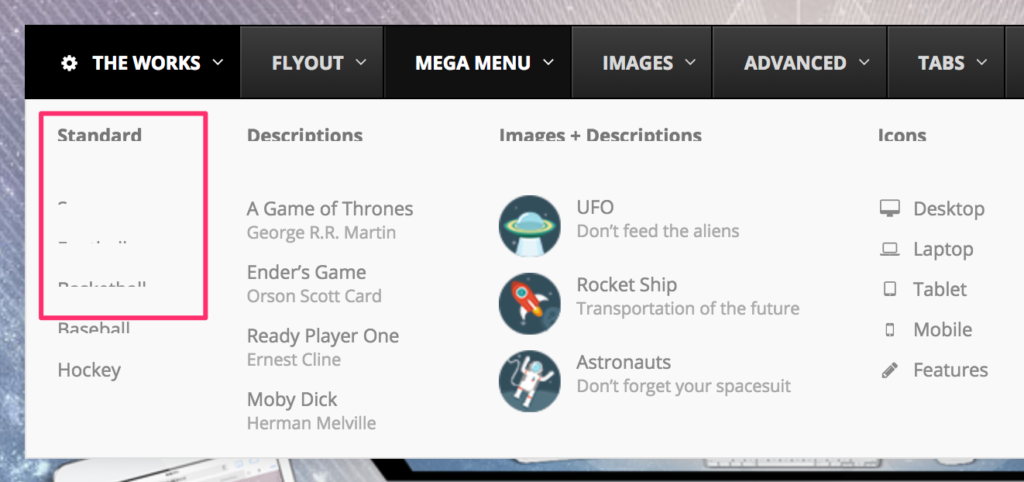
Submenu item clipping issue in Chrome

In November 2017, Google Chrome released an update with a browser rendering bug that visually clips submenu items, making them appear partially obscured until mouseover. This issue occurs under the following circumstances: Chrome browser November 2017 or later AND UberMenu Submenu Transition set to Slide Reveal Solution UberMenu version 3.3.1.1 was released on November 18, 2017. It includes a fix to force Chrome to render the submenu items properly. If you are experiencing this issue, please update to UberMenu 3.3.1.1 or later in order to resolve it Alternatively, you can change your dropdown Transition to Shift Up or Fade, though the update is recommended. More information: Automatic Updates Installing Updates

Disable Link

Menu Item Settings > General > Disable Link The Disable Link setting will change your menu item’s a tag to a span tag, removing the link and just leaving the text. Hovering the item will show the default cursor. Clicking the item will not follow the link. If you are using the Hover trigger, clicking will do nothing. If you’re using the Click trigger, clicking will toggle the submenu open and closed (if there is a dropdown submenu)

GeneratePress

The standard GeneratePress menu will cause residual styling and significant interference with UberMenu. The theme is nice and flexible, however, and provides a pluggable function that we can add to a child theme to easily replace the theme’s default menu. This guide will walk you through integrating the menu manually to replace the theme’s menu, then configuring the menu to align with the theme in the settings. Manual Integration You can choose to integrate via a child theme or a code snippet. Child theme method (recommended) 1. First, create a child theme. If you don’t already have one, GeneratePress provides a starter child theme here: http://generatepress.com/api/themes/generatepress_child.zip Install and activate the child theme. 2. Next, copy this PHP code and paste it into the child theme’s functions.php file: The first function overrides the theme’s menu. The second part stops the theme from running a filter that adds an extra element to items with dropdowns, because the theme does not check that it is only adding this to its own menus. That’s it, we’ve now overridden the theme’s menu. If you uninstall UberMenu in the future, remember to remove this code to revert to the theme menu. Code Snippets Method If you are using a Code Snippets plugin (this plugin is recommended by GeneratePress) to add code to your site, then you’ll need to modify the PHP to look like this instead, since it’ll load in a different sequence: Please note that this solution may not work for all users depending on how CodeSnippets and GeneratePress are installed. We recommend using the child theme option if this does not work for you. Menu Configuration The result of the manual integration will be that the menu will appear full-width on your site. To center the menu, in the UberMenu Control Panel, enable the […]