

Currently in the demo (since v3.7), the following non-default settings are used:
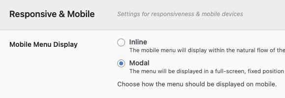
Mobile Menu Display Mode
The Mobile Menu Display Mode setting is set to Modal. This makes the mobile menu appear in a modal popup when triggered by tapping the toggle button.
Modal Header Content & Styling
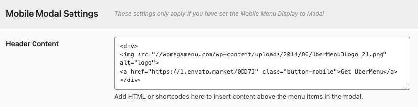
In the Mobile Modal Settings > Header Content setting, the custom markup for the logo and button looks like this:
<div>
  <img src="/path-to-your-image.jpg" alt="logo">
  <a href="yoursite.com/your-link" class="button-mobile">Get UberMenu</a>
</div>
and the CSS used to style it:
.ubermenu.ubermenu-main .ubermenu-mobile-header > div {
    width:100%;
    display: flex;
    justify-content:flex-start;
    align-items:center;
}
.ubermenu.ubermenu-main .ubermenu-mobile-header img {
    padding: 20px;
    width: 100px
}
.ubermenu.ubermenu-main .ubermenu-mobile-header .button-mobile{
    background:#2ab2a4;
    color:white;
    padding:.7em .8em;
    margin-left:auto;
    margin-right:15px;
}
which can be added in the CSS Tweaks setting.
Mobile Submenu Type
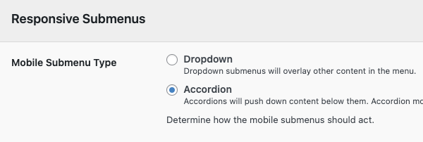
For use with the Modal mode, the Mobile Submenu Type setting is set to Accordion. This means the collapsible submenus will expand and push down the content below them accordion-style, rather than opening as dropdowns that overlap other content.
Responsive Toggle Placement
Optional. Consider switching the toggle placement to Fixed if you have an issue with your responsive toggle positioning on mobile
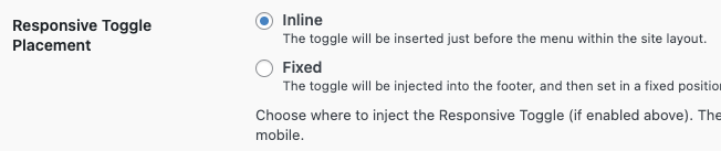
By default, the mobile toggle will appear just before the menu in the site markup, so when the menu switches to mobile, the toggle replaces the menu bar within the layout.
This doesn’t always work well, for example, if the theme’s layout then forces that element to a new row, or hides the container altogether. Switching the menu display mode to modal mode (as above) decouples the menu positioning from the layout, and with the Responsive Toggle settings, you can do the same with the toggle. A few common scenarios:
Adding a toggle in a custom location
If the default toggle location doesn’t work for you, you can disable the “Responsive Toggle” setting and add your own Custom Toggle within your theme layout.
Toggle is hidden on mobile, or a double toggle
If the theme hides UberMenu and/or the responsive toggle on mobile, or you end up with a double toggle (the theme’s wrapping UberMenu’s) a quick solution without having to edit the theme files to integrate is to switch the Mobile Menu Display Mode to Modal and the Responsive Toggle Placement to Fixed, which will move the toggle outside of the theme’s containers and position it in a fixed position.
In this case, you may also want to hide the theme’s toggle with CSS.