
Heads up!
For the vast majority of websites, the logo and nav menu should be two separate elements in the header layout. We do not recommend adding your logo inside of UberMenu. But because a tutorial has been requested, this page exists. Please be sure you have evaluated your site needs and that you truly require a logo within your nav menu before following this guide.

Overview
You can add an Image to any standard menu item. Please refer to that article for details on setting an image.
It’s worth noting that for most sites, you would not place the logo inside of a menu. Generally, keeping the logo separate from the menu, as most themes do, provides the maximum flexibility for your layouts. This article is specifically for those who have made the design choice to have a logo in their menu, and is not a recommendation that you do so if you already have a logo in your theme layout.
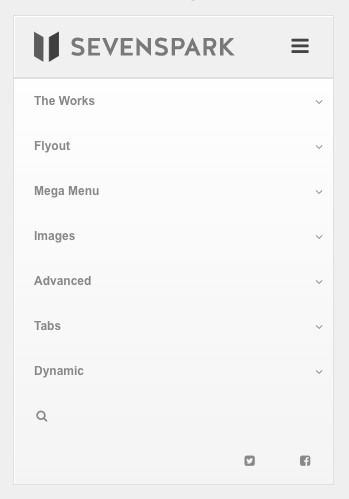
Adding a Logo to the Home item
Add the Home item
Since a logo item would normally link to the home page, generally you would add the “Home” menu item to your menu:

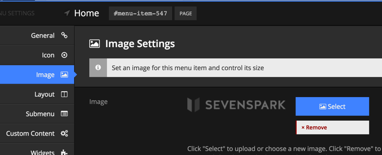
Set your image
In the Image tab for the Home item’s UberMenu Item Settings, select your logo (for more details, see Images)
Disable the text
To display an image with no text beside it, check the “Disable Text” setting

Balancing the logo with other content
Remember, if your image is taller than your other menu content, it will expand the height of the menu. You will need to configure your logo and regular items to display at the same height. You can mix and match the following strategies to create a logo at the appropriate size:
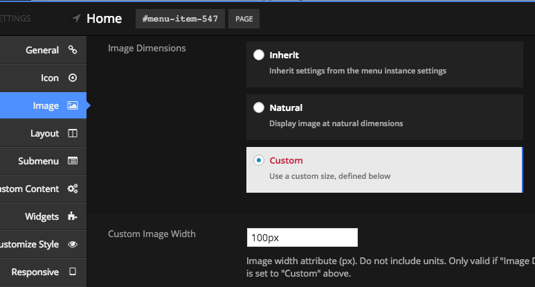
Image Size
Ideally, you would upload your image at the proper size to be displayed in the menu. This way there is no need to scale the image, and you don’t load any more data than you need to.
Scaling the Image
If you want to use an existing image that is larger than necessary, you can scale your image by setting the Image Width

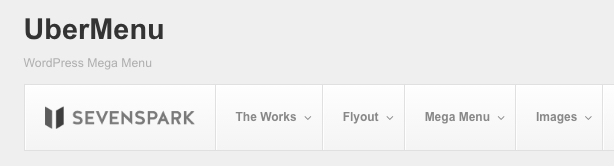
Above, the logo is scaled to the height of the menu items to keep its height the same as the rest of the items
Balancing heights with Item Padding
To balance your logo’s height with your normal menu items’ height, you can adjust the item padding globally and on individual items to accommodate larger images.
For example, you can increase the Top Level Vertical Padding globally in the Customizer

and then reduce the padding on the logo item to keep the menu item heights consistent while their content heights (image vs text) differ.

Above, the image is displayed at a larger height than the text in the other menu items, but the padding on the image item is set to less than the padding on the other items to keep their heights balanced.
Centering a Logo
There are two techniques you might use to center a logo within a menu.
Organically
To organically center a logo, you would place the logo within a menu item, and adjust the widths of the items so that the logo item is naturally centered.

To do this, you would add a logo item as above. Then place it as the middle item of your top level items. Then either adjust the top level item column width settings, or use custom CSS, to adjust the widths of the top level items such that the middle item is visually centered.
You can also change the item content alignment on each top level item to center the text as well.
Overlay
Please note that this technique may require additional customization and CSS skills to accomplish

If you would like to create a logo that overlays your menu and is centered – meaning the logo exceeds the bounds of the menu bar – then you don’t want to place your logo inside the menu at all (if you do, it’ll stretch the menu’s height by default, rather than creating an overlap).
Instead, what you’ll want to do is place the image before your menu, then use absolute positioning to center it.
Keep in mind that with this technique, the logo will not displace any items in your menu, so you run the risk of overlapping the menu items if your logo is too wide, or your items are too many.
1. First, separate your items to the left and right of your menu
To maintain the normal order, set your Horizontal Item Alignment to Right in the Control Panel.

Then change the Alignment setting to Left in the Menu Item Settings for each item you wish to appear to the left of the logo.

This will give you a menu bar with your items separated to the left and right, leaving a space in the middle for your logo.

2. Next, add the logo before the menu
First, upload your logo to the Media Library

Then, copy the URL to create an HTML img tag. You’ll likely want to wrap it in an anchor pointing to your home page.
<a class="my-logo" href="http://mysite.com"><img class="my-logo-img" src="http://uber.dev/wp-content/uploads/2016/02/wordpress-logo-notext-rgb.png" /></a>
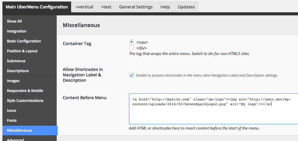
In the UberMenu Control Panel > Main UberMenu Configuration > Miscellaneous, add your logo content in the Content Before Menu textarea.

3. Finally, position the logo
To center the logo over the menu bar, you’ll want to position it absolutely and center it.
Here is some sample code:
.my-logo-img{
	position:absolute;
	z-index:200;
	left:50%;
	margin-left:-100px;
	top:-80px;
}
The left and margin-left properties center the logo. The margin-left should be 1/2 of the image’s width. Note that this is assuming the logo’s container is relatively positioned and wraps the menu precisely.
Naturally, you’ll need to adjust the top positioning depending on your logo size.
You will want to place this in the Desktop CSS Tweaks, so that it does not apply on mobile.
If your site is responsive such that as the viewport narrows, the menu items begin to overlap the logo, a good strategy is to use a media query to either reduce the logo width, or else simply only apply absolute positioning above that width, so that once the logo no longer fits, its simply appears above the menu.


Note that depending on how your theme is set up, you may need to further custom style the logo and menu margins to set your layout up nicely as your viewport resizes.
Mobile Considerations
Out of the box, all top level items are hidden by default when the menu is below the responsive breakpoint. This means that your menu item logo will not be visible when viewing the site on mobile prior to toggling the menu open.

If you want, you can place a logo either in the responsive toggle, or outside of the menu.
Placing a logo in the responsive toggle
Please note if you place a logo in the responsive toggle, it cannot link to another page, because the toggle itself has a click/tap action bound to it.
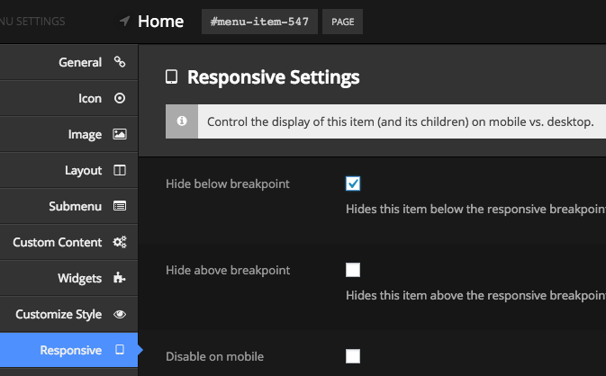
Disabling the menu item logo
To prevent the logo from displaying in the menu itself, hide the item on mobile in the logo menu item by checking “Hide below breakpoint”
Add a logo to the responsive toggle
First grab the URL for your image, or upload a new image in the media library.
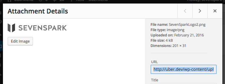
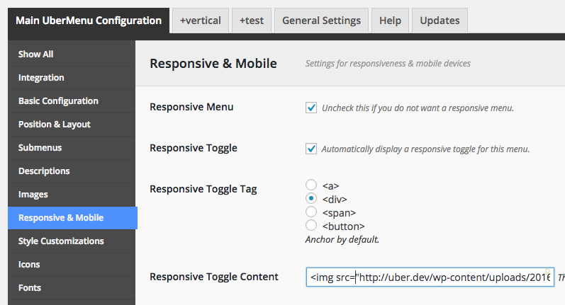
Then in the UberMenu Control Panel, add your image to the Responsive Toggle Content setting
<img src="//uber.dev/wp-content/uploads/2016/02/SevenSparkLogo2.png" alt="My logo"/>
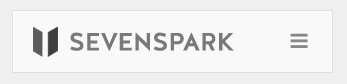
If you’d like to align your hamburger bars to the right, add this CSS in your Mobile Tweaks
.ubermenu-responsive-toggle .fas{
  float:right;
  margin:0;
  font-size:20px;
  padding:5px 0;
}
Adjust the padding and font-size as necessary to match the toggle icon size with that of your logo.
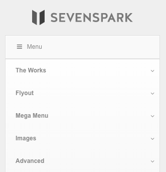
Placing a logo above the menu
To place the logo above the menu, you can follow the same strategy except place the img tag before the menu instead of in the toggle content.
Disabling the menu item logo
To prevent the logo from displaying in the menu itself, hide the item on mobile in the logo menu item by checking “Hide below breakpoint”
Adding the logo above the menu
First grab the URL for your image, or upload a new image in the media library.
Then in the UberMenu Control Panel, add your image to the Content Before Menu setting
<a href="http://mysite.com" class="um-logo"><img src="http://uber.dev/wp-content/uploads/2016/02/SevenSparkLogo2.png" alt="My logo"/></a>
(Replace mysite.com with your domain)
To center align the logo and space it out a bit, you can add this CSS in your Mobile CSS Tweaks
.um-logo{
    padding:20px;
    display:block;
    text-align:center;
}
Or style it however you like, of course.

To ensure that this logo only appears on mobile, add this CSS to your Desktop CSS Tweaks:
.um-logo{
  display:none;
}