

The Tabs item allows you to create a block which contains multiple panels of content; each panel is shown in turn as its related tab is activated.
Tabs can only appear in submenus. They cannot be top level menu items
Demo Recreation Tutorial
This video walks you through recreating the Tabs submenu in the demo.
Adding a Tab block
In the Appearance > Menus Screen, open the UberMenu Advanced Items section in the left panel. Check the Tabs Block item and click Add to Menu

The Tabs Block item does not do anything on its own. To give the block content, add child and grandchild items to the Tabs Item. Child items become the Tab Toggles. Child items of the Tab Toggles appear in the Tab’s Content Panel.
In this example, United States, Canada, and Italy become the tab toggles. The Arches Natinal Park, Glacier National Park, and Yosemite National Park items will be displayed in the United States Tab’s Content Panel.

This is the result out of the box:

You can add an additional level of items to create column content.


You can also assign or inherit images images for each item

Note that the Submenu settings for the Tab Toggle items will control their respective Content Panels. For example, we can set the default submenu columns to 1/3 for the United States item to evenly distribute the columns:

Configuring the Tab Block
To change the settings of the Tab Block, click the Uber button on the [UberMenu Tabs Block] item.
Tabs Layout
The tab toggles can appear to the left, right, top, or bottom of the content panel

Left
Right

Top
Note: When you switch to the Top alignment, change your Tabs Toggles Layout Width and Panels Layout Width to Full Width, or leave it set to Automatic


Bottom
Note: When you switch to the Bottom alignment, change your Tabs Toggles Layout Width and Panels Layout Width to Full Width, or leave it set to Automatic

Tab Block Width
The Tab Block Width controls the width of the entire Tab Block (tab toggles + content panels). The only reason to change this from Full Width is if you want another column to occupy the same row with your tabs.
Tab Toggles Layout Width
This setting controls the width of the tab toggles.
Left or Right
For left or right tab block layouts, you’ll want this setting to complement the Panels Layout Width setting. So for example, if you want the Tab Toggles to take up 1/3 of the width, and the Content Panels to take up the rest, you would set the Tab Toggles Layout Width to 1/3 and the Panels Layout Width to 2/3. Leave the Panels Layout Width set to Automatic to automatically set the complementary columns width.

In almost all cases, you will want the sum of the widths to be 1, so leaving the Panels Layout Width set to Automatic is generally all you need to do.
Top or Bottom
In this case, you will almost always want the Tab Toggles and Content Panels to be full width. Leave them set to Automatic to make this easy.
Panels Layout Width
Leave this set to Automatic to intelligently determine the panels width.
Panels Columns Default
The default column widths for items in the content panels. This can be overridden in each Tab Toggle’s submenu settings.
Grid Panels
If you are creating image grids in your content panels and want the gutters between the images to be the same as the gutters on the edges, enable this.
Panel Padding
Adjusts the padding around the edge of the content panels.
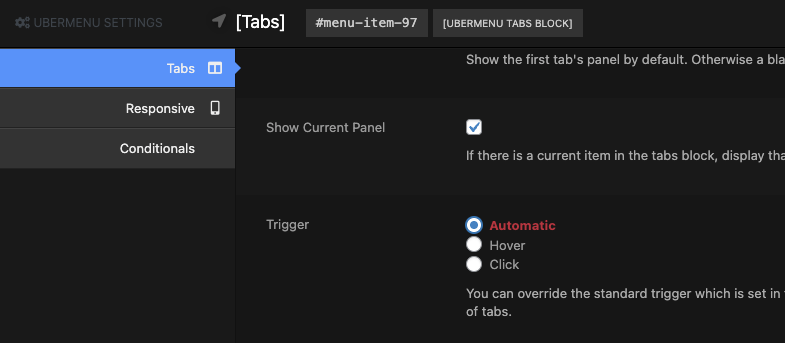
Show Default Panel
This will automatically display the panel of the first item in the tab group. Disabling this means nothing will show by default until a tab is activated.
Show Current Panel
Since version 3.4
If an item in the tabs block is current (matches the current page), that tab’s panel will display by default rather than the first panel.
Trigger
The Trigger controls which user interaction activates a tab (hover or click).
Leave the Trigger set to Automatic to inherit the Trigger from the main menu settings. You can override the trigger for this specific set of tabs with this setting. So if you have a hover-triggered menu, but want the tabs to be activated by click, change this setting to Click
Dynamic Panel Sizing
By default, all content panels in your tabs block will have the same height – they will be sized to the tallest element in the tabs block, either the tallest content panel or the tab toggles column.
If you enable this setting, each content panel will be sized independently to its content – though it will never be shorter than the tab toggles column.
Dynamic Panel Animation
If you enable the Dynamic Panel Sizing, you can also choose to have an animated transition when the panel height changes as you switch between tabs.
Nesting Tabs
You can also nest groups of tabs by placing [Tab] items as submenus of your toggle items. Here’s an example using Dynamic Items, as seen in the demo

