This feature is experimental. Its implementation may change in the future
The Image Portal Feature
An Image Portal allows you to display an item’s image, on hover, in a separate area of the menu.
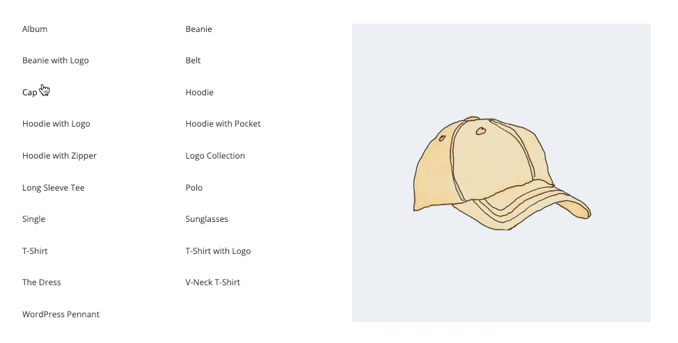
The Portal is the area which displays the images separately from the source items.
Note that in the Portal setup, the images will not be clickable, as they will disappear when hovering off of the associated menu items.
Setup Instructions
Overview
We’ll set up a group of menu items with images assigned. Then we’ll add a custom content item elsewhere in the layout, containing the [ubermenu_image_portal] shortcode, which will select those menu items and display their images when hovered.
1. Create a list of menu items
First, create your list of items. These items will trigger an associated image to appear in the Portal when you hover over them.
You can put them in whatever layout you like (multiple columns, rows, etc), however, none of the items should have dropdown submenus, as the dropdown trigger mouse interaction would conflict with the image hover mouse interaction.
2. Apply an image to each item
You can set an Image for each item, either manually or by inheriting the featured image from that post.
Make sure you set the Item Layout for the items to “Image Above”, either on the item itself or in the Control Panel (global settings).
These images will be collected and removed from the source menu items and displayed in the Portal instead. (For now, you’ll see them with the items, but that’ll change once we add the shortcode in step 4).
3. Give your item source container a selector
When we create the actual Portal, we’ll give it a standard CSS/JS selector to indicate which items’ images should be displayed in the portal.
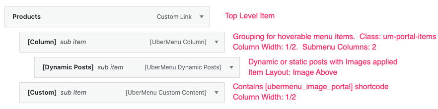
You can set this up however you like, but one simple way to do this is to wrap the items in a [Column] item, and give that column a class (in this example, “um-portal-items”). You might create your class name to better identify the group of items it’s wrapping.
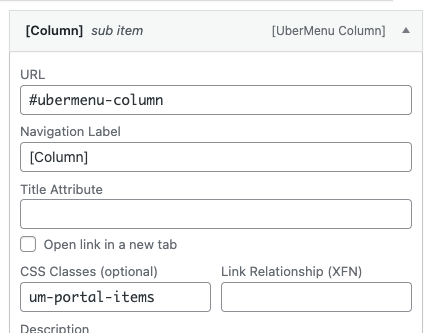
Then we can select the menu items in this column using the selector .um-portal-items > .ubermenu-submenu .ubermenu-item
This step is technically optional, you could also use the auto-generated ID from the parent item to create your selector. However, using a class is generally easier to understand and reference later, and using a [Column] item makes selecting a single group of items straightforward.
4. Set up the Portal
To set up the Portal (where the images will be displayed), we will add a custom content item with the [ubermenu_image_portal] shortcode inside it.
First, add a Custom Content Item to your submenu, and configure its layout as desired. In the example above, the items are in a 1/2 column, and the custom content item is also a 1/2 column.
Next, add the shortcode inside the Custom Content area. We will use the select attribute to select the items that should have their images displayed in the Portal. Note that the selector should always select a .ubermenu-item element.
With our example selector above, it’ll look like this:
[ubermenu_image_portal select=".um-portal-items > .ubermenu-submenu .ubermenu-item"]
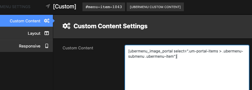
The shortcode also accepts a class attribute if you would like to apply a custom class for styling the portal.
And that’s it! Here’s a quick visual overview of the setup for the example above:
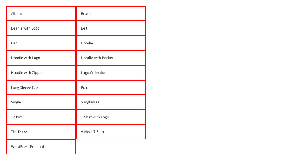
A quick tip on selectors
Not sure if your selector is quite right? A simple way to test is to create a style using your selector and setting the borders to see if your items are styled.
.um-portal-items > .ubermenu-submenu .ubermenu-item{
    border:2px solid red;
}