Avada 5.9 Menu Bounds
Looks like Avada changed the class of their wrapper from fusion-ubermenu to fusion-ubermenu-mobile in version 5.9. Please update your bounding CSS to the following if your menus are suddenly bounded to the menu width:
.fusion-main-menu.fusion-ubermenu,
.fusion-main-menu.fusion-ubermenu-mobile{
    position:static;
    overflow:visible;
}
Current Avada Bug – hidden mobile menu
Update: Fixed in 5.6.2 Update: appears to be back in 5.7
In a mid-2018 Avada update, the menu ends up hidden on mobile devices. Until Avada updates the theme to resolve the bug, you can add this CSS in your CSS Tweaks as a temporary fix:
#wrapper .fusion-main-menu.fusion-ubermenu-mobile,
#wrapper .fusion-main-menu.fusion-ubermenu {
    display: block;
    overflow:visible;
}
Avada will automatically detect and integrate UberMenu as your main menu.
UberMenu Settings
You may want to change UberMenu’s Menu Bar Alignment to “Right”.
At that point, you will also likely want to change the Submenu Bounds (Maximum Submenu Width) to “Unbounded”.
Since Avada 5.1 or so, Avada wraps the menu in an element that bounds the submenu as well, so you’ll want to add this CSS to prevent that:
.fusion-main-menu.fusion-ubermenu,
.fusion-main-menu.fusion-ubermenu-mobile{
    position:static;
    overflow:visible;
}
If the submenu then extends to the full width of the viewport, you can bound it within the theme’s content area by using this CSS:
.fusion-header .fusion-row{
  position:relative;
}
Submenu layering with slider
If your submenu is appearing below the slider, you will need to adjust the z-index of the theme’s header and slider containers with this CSS:
.header-wrapper{
  position:relative;
  z-index:50;
}
#sliders-container{
  position:relative;
  z-index:30;
}
#main{
  position:relative;
  z-index:20;
}
Sticky Extension
The menu may not become sticky due to a transform in the Avada header. In this case, add this CSS:
.fusion-header{
  transform:none !important;
}
Sticky Header/Hidden Menu
The menu may not become sticky due to a transform in the Avada header. In this case, add this CSS:
.fusion-header{
  transform:none !important;
}
Your theme may hide the menu with display:none when the header becomes sticky. If so, this CSS should reveal it again:
.fusion-is-sticky .fusion-sticky-menu-1 .fusion-main-menu.fusion-ubermenu{
    display:block;
}
If you need to write styles specifically for the menu when it is in the theme’s sticky header, you can prefix them with the .fusion-is-sticky class. For example, this sets the UberMenu font color when the theme’s header is sticky:
.fusion-is-sticky .ubermenu-main .ubermenu-nav .ubermenu-item.ubermenu-item-level-0 > .ubermenu-target{
  color:#222;
}
Main Navigation Only
Please note, Avada only supports UberMenu in the Main Navigation theme location. If you want to use UberMenu in the Top Navigation theme location, you’d need to use Manual Integration to move the menu outside of the .top-menu div to prevent the theme from interfering with the menu. (See below under “Top Menu”)
Special note on Avada 3.7.1 bug
Please note, in Avada 3.7.1, the theme adds the class ubermenu to the body tag, which causes issues. ThemeFusion has released a patch which you can apply manually until they get an official fix out:
Other CSS Snippets
Expand Menu Bar to content area extents
Some Avada headers add padding and margin to the container/row that wraps UberMenu, restricting its width. This CSS will remove that extra spacing and allow the menu to expand.
Avada 5+
Depending on your configuration:
#wrapper .fusion-secondary-main-menu,
#wrapper .fusion-secondary-main-menu .fusion-row{
  padding:0;
  max-width:100%;
}
or
.fusion-header-wrapper .fusion-header{
  padding:0;
}
Avada 3.8+
#wrapper .fusion-secondary-main-menu,
#wrapper .fusion-secondary-main-menu .fusion-row{
  padding:0;
  max-width:100%;
}
Pre Avada 3.8
#wrapper .header-wrapper #small-nav{
  padding:0;
}
#wrapper .header-wrapper #small-nav .avada-row{
  margin:0;
}
Mobile Logo & Responsive Toggle Aligned
This CSS will reveal the Avada logo on mobile and move the UberMenu responsive toggle to the right of the logo. May only work with certain Avada headers. Best placed in the UberMenu Mobile CSS Tweaks
Avada has improved the header code to make it more flexible, so you may need to try both of these below depending on your version and configuration:
Current Version of Avada
#wrapper .ubermenu-responsive-toggle,
#wrapper .ubermenu-sticky-toggle-wrapper{
    float:right;
    margin-top:-40px;
    font-size:16px;
    clear:none;
}
Earlier Versions of Avada
#wrapper #header .logo{
	float:left !important;
}
#header .logo img{
	display:block;
}
#header #nav-uber{
	clear:none;
}
#header .ubermenu-responsive-toggle{
	float:right;
	margin-top:-25px;
	font-size:24px;
}
Disable mobile sticky header
To disable the theme’s sticky header on mobile so that the menu may be properly scrolled, you can disable this setting in the Avada settings:

or, add this CSS:
.fusion-is-sticky .fusion-header{
  position:relative !important;
}
.fusion-is-sticky .fusion-header-sticky-height{
  display:none !important;
}
in your Mobile CSS Tweaks.
Or, if you are using just the sticky menu option, and not the full sticky header:
.fusion-is-sticky .fusion-sticky-menu-only .fusion-secondary-main-menu{
    position:relative !important;
}
Top Menu
Avada’s UberMenu support is only for the main menu. If you want to use UberMenu in Avada’s Top Menu location, the theme is going to interfere with the menu functionality, so you need to use Manual Integration
To do this, in your child theme, create this directory structure and create a blank header-menu.php file. Doing this with your child theme activated should create a blank bar at the top of the site (assuming you are using the appropriate Avada header style).
/framework/headers/header-menu.php
Add this PHP to the file:
<?php if( function_exists( 'ubermenu' ) ): ?>
	<?php ubermenu( 'main' , array( 'theme_location' => 'top_navigation' ) ); ?>
<?php endif; ?>
If you are using a Secondary Configuration (which you will likely want to to style the menu differently from the main menu, change main in the code above to the ID of your configuration – or alternatively generate the appropriate manual integration code in the Control Panel and use that instead.
Depending on how you do the manual integration and the version of Avada you are using, you may need to add this CSS to expand the theme’s container to allow the menu to be full width:
.fusion-secondary-header .fusion-alignleft{
  float:none;
}
Please note that the Avada styles can override the Customizer styles in this menu position for things like font color. If you want to prevent the theme from interfering entirely, you may need to move the menu outside of the theme’s .header-social div
Sidebar Menu
If you haven’t already, read the documentation on Vertical Menus
Widgets and Residual Styling
Out of the box, if you try to add an UberMenu widget to the Avada sidebar, it’ll look awful, due to residual styles from the theme.
Global Sidebar Menus
If you are using a global sidebar menu, your best option by far is to add your menu directly in the sidebar template, rather than as a widget. For example, add the PHP code from the UberMenu Manual Integration section of the Control Panel to the templates/sidebar-1.php or templates/sidebar-2.php. This should avoid most residual styling from the theme and allow you to control the menu properly.
Page-specific sidebar menus
If you are using different widget areas on different pages (meaning you will have different menus on different pages), you have two options:
1. Custom Conditions
In keeping with the suggestion of adding the menu directly to the template files, you can still do this, but add in conditional statements to display the menu only on specific pages. If you’re a developer, this is probably your best option
2. CSS Override
If you’re not familiar with PHP, or if your logic is such that it makes the PHP overly complex, or if you need a menu in between other widgets, then you can continue to use UberMenu as a widget, and attempt to override the interfering styles from the theme.
The main problematic style that the theme adds which makes things look like a mess is this:
.fusion-content-widget-area .widget li a {
  display: inline;
}
You can override it by adding this:
.fusion-content-widget-area .widget .ubermenu .ubermenu-target{
  display:block;
}
This should make the menu display properly again.
However, be advised that there may be other styles from the theme that will interfere with the menu (such as link colors, etc). You’ll need to override these with custom CSS if you encounter them.
If you are running an older version of Avada
Out of the box, Avada’s menu is going to interfere with UberMenu, so the Avada developers have created an easy switch in the Avada settings to enable UberMenu compatibility.
(With the current version, you should be able to skip this step)
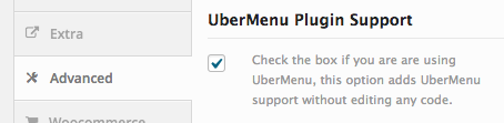
When you activate UberMenu and Avada together, you should see this message from the theme:

In the Avada settings, click the “Advanced” tab and then check the “UberMenu Plugin Support” checkbox.
Please note that as of Avada 3.8, this may no longer be necessary.