
The Twenty Twenty theme’s CSS will interfere with UberMenu when using Automatic Integration due to the theme’s hard-coded nav and ul containers. Complete the following steps to manually integrate with Twenty Twenty and eliminate the interference from the theme.
Desktop Manual Integration
1. Set up a child theme
If you haven’t already, remember to install and activate a child theme to contain your changes and preserve them when you update the parent theme.
2. Copy the header.php
Copy the header.php file from the parent theme into the main directory of the child theme. This is where we will make the code changes.
3. Replace the theme’s menu with UberMenu
In the child theme’s header.php, find the .header-navigation-wrapper div. Inside this div you will see a check for has_nav_menu( 'primary' ). We will replace this entire section (the nav.primary-menu-wrapper) conditionally with UberMenu. These are lines 84 – 122 in version 1.2.
Before:
<?php
if ( has_nav_menu( 'primary' ) || ! has_nav_menu( 'expanded' ) ) {
	?>

		<nav class="primary-menu-wrapper" aria-label="<?php esc_attr_e( 'Horizontal', 'twentytwenty' ); ?>" role="navigation">

			<ul class="primary-menu reset-list-style">

			<?php
			if ( has_nav_menu( 'primary' ) ) {

				wp_nav_menu(
					array(
						'container'  => '',
						'items_wrap' => '%3$s',
						'theme_location' => 'primary',
					)
				);

			} elseif ( ! has_nav_menu( 'expanded' ) ) {

				wp_list_pages(
					array(
						'match_menu_classes' => true,
						'show_sub_menu_icons' => true,
						'title_li' => false,
						'walker'   => new TwentyTwenty_Walker_Page(),
					)
				);

			}
			?>

			</ul>

		</nav><!-- .primary-menu-wrapper -->

	<?php
}
after:
<?php if( function_exists( 'ubermenu' ) ): ?>
	<?php ubermenu( 'main', array( 'theme_location' => 'primary' ) ); ?>
<?php else: ?>

	<?php
	if ( has_nav_menu( 'primary' ) || ! has_nav_menu( 'expanded' ) ) {
		?>

			<nav class="primary-menu-wrapper" aria-label="<?php esc_attr_e( 'Horizontal', 'twentytwenty' ); ?>" role="navigation">

				<ul class="primary-menu reset-list-style">

				<?php
				if ( has_nav_menu( 'primary' ) ) {

					wp_nav_menu(
						array(
							'container'  => '',
							'items_wrap' => '%3$s',
							'theme_location' => 'primary',
						)
					);

				} elseif ( ! has_nav_menu( 'expanded' ) ) {

					wp_list_pages(
						array(
							'match_menu_classes' => true,
							'show_sub_menu_icons' => true,
							'title_li' => false,
							'walker'   => new TwentyTwenty_Walker_Page(),
						)
					);

				}
				?>

				</ul>

			</nav><!-- .primary-menu-wrapper -->

		<?php
	}
endif;
That’s it for the desktop. This will eliminate residual styling coming from the .primary-menu and .primary-menu-wrapper. Please see the Recommended Settings at the end for suggestions on how to configure the plugin with this theme.
Mobile Menu Options
Twenty Twenty uses an entirely separate menu on mobile, so it requires a separate integration. Note that the theme hides the desktop menu, where we integrated UberMenu above, on mobile.
Option 1: Using the theme menu on mobile
If you want to use the theme menu on mobile, you can just assign a menu to the Mobile Menu theme location in Appearance > Menus > Manage Locations. (Note that if you do not assign a menu to the mobile theme location, it’ll fall back to the Primary theme location, so if you’re doing things that way, make sure you have not activated UberMenu on the Primary theme location).
Do *not* activate UberMenu Automatic Integration on the Mobile Menu theme location, and the theme menu will control the mobile menu.
This is the simplest solution if you like the theme menu on mobile, however:
Please note that the theme menu will not process Advanced UberMenu Items (dynamic terms/posts, tabs, menu segments, etc). If you have these items in your menu, then you can either assign a different menu on mobile (which does not contain these items), or you can integrate UberMenu on mobile as well.
Option 2: Using UberMenu on mobile
If you want to use UberMenu on mobile, there are two options: reveal the version used on desktop with CSS, or manually integrate in the mobile template.
Solution 1: CSS Solution
Twenty Twenty hides the desktop menu (which has already been integrated as UberMenu) on mobile. So the simplest solution is to just force it to reveal UberMenu on mobile. The following CSS reveals UberMenu, and hides the theme’s menu toggle.
/* Show desktop menu on mobile */
div.header-navigation-wrapper{
	display:block;
	position:absolute;
	width:100%;
	left:0;
	z-index:50;
}
/* Hide theme menu toggle */
.header-inner button.nav-toggle{
	display:none;
}
/* Position UberMenu Toggle */
.header-inner .ubermenu-responsive-toggle{
	position:absolute;
	right:0;
	margin-top:-40px; /* adjust to control vertical position */
}
/* UberMenu position and background color */
div.header-inner .ubermenu.ubermenu-responsive{
	background:white;
	margin-top:20px;
}
The CSS can be added in your Mobile CSS Tweaks
In the Control Panel > Main Configuration > Responsive & Mobile, it is recommended that you remove the text in the Responsive Toggle Text so that only the icon appears.
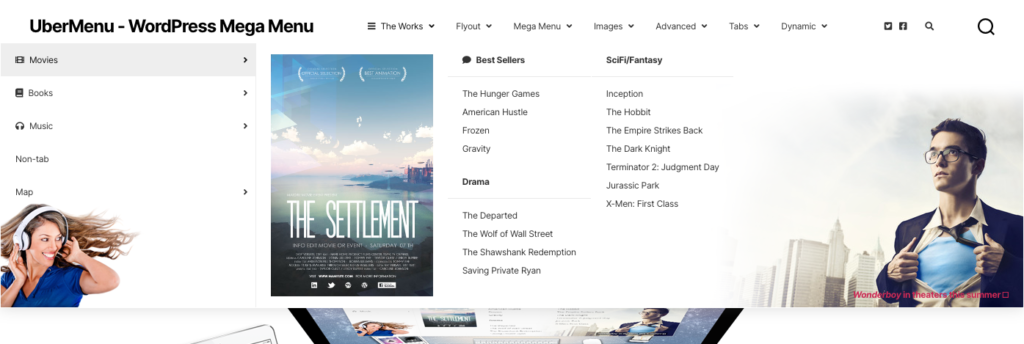
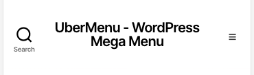
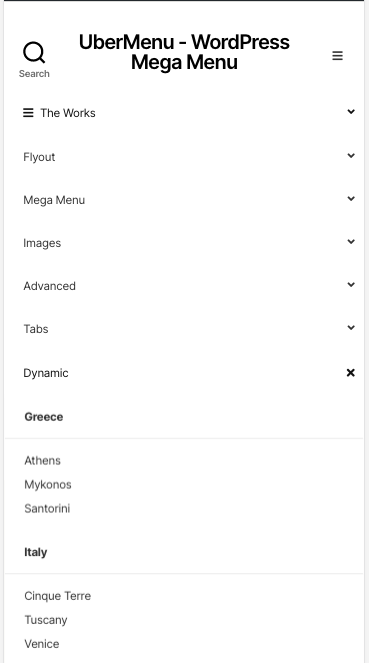
This is the result:
Closed:
Open:
Solution 2: Manual Integration
For most users, we recommend the above CSS solution as it is simpler, and there may still be interference when adding UberMenu within the theme’s modal menu wrapper. For advanced users, you may want to pursue this route, which we will outline here.
If you prefer to manually integrate for the mobile menu as well, you can copy the template-parts/modal-menu.php template into the same directory in the child theme. Then conditionally replace the contents of the .menu-top block (everything except the close toggle at the top), with UberMenu.
In this case, you’ll also want to disable the Responsive Toggle and Collapse by default settings in the Control Panel so that the menu displays by default without an extra toggle.
Recommended Settings
These are suggested settings you can configure in the UberMenu Control Panel and Customizer.
1. Expand Submenu Full Width
As the Twenty Twenty menu is right aligned, set the Submenu Bounds (Maximum Submenu Width) to Unbounded to allow the submenus to expand full width.
If you would like to bound the submenu to the content width, add this CSS to your CSS Tweaks:
div.header-inner{
	position:relative;
}
2. Select Skin
You may want to switch to the Minimal Base or Vanilla Skins in order to better approximate the standard look of this theme.