
Control Panel > Configuration > Responsive & Mobile > Mobile Menu Display
UberMenu provides two mobile display modes, which control the positioning and display of the menu when in its mobile layout (below the responsive breakpoint) – Inline and Modal.

Inline Mode
By default, UberMenu will display inline on mobile.
That is, when you click the responsive toggle button, the menu will be revealed in its natural location within the theme’s layout, pushing content below it down (unless the theme is positioning it absolutely or fixed).
The menu is just another element in the layout, it is simply revealed inline. You can scroll and interact with the site, leaving the menu open while doing so if desired.

Modal Mode
In Modal mode, the toggle will remain inline, but when the menu is toggled open, it will display as a full screen modal overlay. The user must interact with the menu – either selecting a link or tapping to close the window – before proceeding.
Accordion Submenus Recommended
Generally, when in Modal mode, it makes sense to set the Mobile Submenu Type to Accordion for best results.
Modal-specific settings
The modal-specific settings can be found in the UberMenu Control Panel > Main Configuration > Responsive & Mobile > Mobile Modal Settings.

Modal Background Color
When using the menu in modal mode, you can set the background of the modal overlay. If your menu background is transparent on desktop, this is critically important for the menu to display properly on mobile.
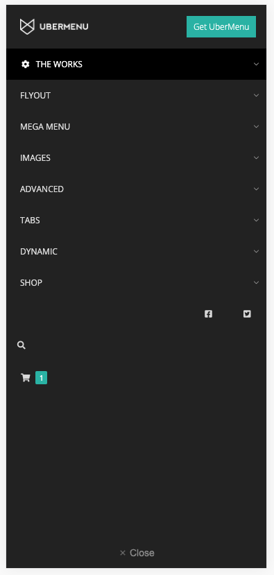
Custom Header and Footer
The modal menu has settings for custom header and footer content, which can contain HTML and/or shortcodes. The header shown in the example above is just custom HTML for an image and button.
If you’d like to create a similar header, here’s the markup used
<div>
  <img src="/path-to-your-image.jpg" alt="logo">
  <a href="yoursite.com/your-link" class="button-mobile">Get UberMenu</a>
</div>
and the CSS used to style it:
.ubermenu.ubermenu-main .ubermenu-mobile-header > div {
    width:100%;
    display: flex;
    justify-content:flex-start;
    align-items:center;
}
.ubermenu.ubermenu-main .ubermenu-mobile-header img {
    padding: 20px;
    width: 100px
}
.ubermenu.ubermenu-main .ubermenu-mobile-header .button-mobile{
    background:#2ab2a4;
    color:white;
    padding:.7em .8em;
    margin-left:auto;
    margin-right:15px;
}
which can be added in your CSS Tweaks setting.
Modal Close Button Shortcode
To add a custom close button in your header or footer, you can use the [ubermenu_mobile_close_button] shortcode.
Shortcode Attributes
| Attribute | Description |
|---|---|
| classes | CSS classes to apply to the button element. Will be appended to the existing ubermenu-mobile-close-button class |
Content
The content appears between the opening and closing shortcode tags and will be the content of the button.
The content of the close button will default to the × glyph if no content is provided.
Example
Shortcode:
[ubermenu_mobile_close_button classes="my-button"]Click Me[/ubermenu_mobile_close_button]
Output:
<button class="ubermenu-mobile-close-button my-button">Click Me</button>
Customizing the header and footer with filters
For full control, you can use the Modal Filters to customize the header and footer content, including removing the default close button.
Inline vs Modal Tips
Sticky Header scenario
If your theme has a sticky header, the Inline option will likely cause problems as the sticky header will prevent it from scrolling. Switching to the Modal option bypasses the sticky header issue.
Partial-width theme layout scenario
Most themes will wrap the menu in a full width block on mobile, but some themes will place it in a smaller column. In those cases, the Inline menu will be forced to be squeezed into that column. Switching to the Modal option avoids the need to rework the theme layout or move the menu.
Mobile Menu Theme Residual Styling
If your theme interferes with the menu on mobile due to its CSS styles, switching to the Modal mode may help – this is because in Modal mode, the menu is moved out of the header and into the footer when toggled open, which in most cases will prevent interfering styles from the theme from applying.