Activating UberMenu Sticky Extension will automatically make your UberMenu sticky, however you can use the settings panel (Appearance > UberMenu > Main Configuration > Sticky) to tweak its appearance.
Setting
Purpose
Enable Sticky Menu
Make this menu sticky when the user scrolls past it.
Top Offset
If you want your sticky menu to stick to the absolute top of the window, leave this at 0. If you would like it to be vertically offset, increase the Top Spacing appropriately. If you set this to 20, the menu will stick 20 pixels from the top of the window.
Full Width Sticky Menu Bar
When enabled, when your menu sticks the menu bar will expand to the full width of the screen. If you’d rather it did not, disable this.
Enable Clearfix
If your menu immediately gets stuck to the top of your viewport even before you scroll, the most likely issue is that your theme’s header needs to be properly cleared, as the elements may be absolutely positioned. Enable this option to clear the menu and keep it in place until you scroll. You may also need to add some padding or margin to the theme’s container element.
Center Inner Menu Width
If you have activated the Expand Menu Bar Full Width on Scroll option, you may want the menu items to still be contained within the content area of your site, rather than being aligned to the left of the window. Normally you would set this to the width of your content area.
Sticky Menu Bar Background
If you are using a transparent background on your menu bar, you’ll probably want to set a color for when the menu sticks. This makes it much easier to read the text while it is overlaid over other content.
Advanced Sticky Settings – use with caution
Setting
Purpose
Stick on Mobile Devices
Warning: Experimental Tested in iOS Safari and Android Chrome & Stock browsers, this setting will make your menu sticky on mobile devices and attempt to make any hidden content accessible via overflow touch scrolling. Note that the iOS implementation of overflow scrolling seems to be much smoother than Android’s, which can be unreliable at times. Overall, mobile browser support for fixed-element overflow touch scrolling is still lacking. Therefore, use at your own risk. This is an experimental feature and may not work with all sites. If not working as expected on your site, simply disable. Suggested alternative: ShiftNav.
Always Sticky
Always stick the menu to the top of the page without scrolling. If you use this option, you will likely want to manually add some padding/margin to your site container, and a max-width on the .ubermenu element if you are not expanding the menu full width. Keep in mind that features like the special classes will no longer work as intended since this feature disables the javascript component of the extension. Centering will be controlled through the core UberMenu options, not the Sticky-specific options. Not recommended for use when Stick on Mobile Devices
Apply Sticky To
If you only want the menu to be sticky on a specific page, enter the post ID here
Older versions
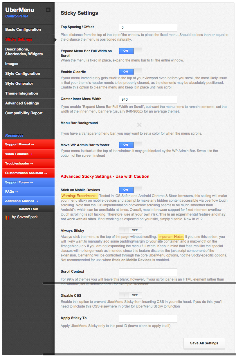
Activating UberMenu Sticky Extension will automatically make your UberMenu sticky, however you can use the settings panel (Appearance > UberMenu > Sticky Settings) to tweak its appearance.
Setting
Purpose
Top Spacing / Offset
If you want your sticky menu to stick to the absolute top of the window, leave this at 0. If you would like it to be vertically offset, increase the Top Spacing appropriately. If you set this to 20, the menu will stick 20 pixels from the top of the window.
Expand Menu Bar Full Width on Scroll
By default, when your menu sticks the menu bar will expand to the full width of the screen. If you’d rather it did not, disable this.
Enable Clearfix
If your menu immediately gets stuck to the top of your viewport even before you scroll, the most likely issue is that your theme’s header needs to be properly cleared, as the elements may be absolutely positioned. Enable this option to clear the menu and keep it in place until you scroll.
Center Inner Menu Width
If you have activated the Expand Menu Bar Full Width on Scroll option, you may want the menu items to still be contained within the content area of your site, rather than being aligned to the left of the window. Normally you would set this to the width of your content area.
Menu Bar Background
If you are using a transparent background on your menu bar, you’ll probably want to set a color for when the menu sticks. This makes it much easier to read the text while it is overlaid over other content.
Move WP Admin Bar to Footer
The WordPress Admin Bar is also a sticky menu. If you have both at the top, they will overlap and one will become inaccessible. This setting moves your Admin bar to the bottom of the page and inverts its menus. (As an alternative, see How to use both the Sticky and the Admin Bar at the top of the page)
Advanced Sticky Settings – use with caution
Setting
Purpose
Stick on Mobile Devices
Warning: Experimental Tested in iOS Safari and Android Chrome & Stock browsers, this setting will make your menu sticky on mobile devices and attempt to make any hidden content accessible via overflow touch scrolling. Note that the iOS implementation of overflow scrolling seems to be much smoother than Android’s, which can be unreliable at times. Overall, mobile browser support for fixed-element overflow touch scrolling is still lacking. Therefore, use at your own risk. This is an experimental feature and may not work with all sites. If not working as expected on your site, simply disable. New in v1.2.
Always Sticky
Always stick the menu to the top of the page without scrolling. Important Notes If you use this option, you will likely want to manually add some padding/margin to your site container, and a max-width on the #megaMenu div if you are not expanding the menu full width. Keep in mind that features like the special classes will no longer work as intended since this feature disables the javascript component of the extension. Centering will be controlled through the core UberMenu options, not the Sticky-specific options. Not recommended for use when Stick on Mobile Devices is enabled.
Enable Clearfix
If your menu immediately gets stuck to the top of your viewport even before you scroll, the most likely issue is that your theme’s header needs to be properly cleared, as the elements may be absolutely positioned. Enable this option to clear the menu and keep it in place until you scroll.
Scroll Context
For 99% of themes you will leave this blank, however, if your scroll pane is an HTML element rather than the window, set its selector here – for example “#content”
Disable CSS
Enable this option to prevent UberMenu Sticky from inserting CSS in your site head. If you do this, you’ll need to include this CSS elsewhere in order for UberMenu Sticky to function
Apply Sticky To
If you only want the menu to be sticky on a specific page, enter the post ID here