
Cart Summary / Info
Since UberMenu v3.5 How to add a WooCommerce cart summary item to your menu 1. Allow shortcodes in your menu…
Since UberMenu v3.5 How to add a WooCommerce cart summary item to your menu 1. Allow shortcodes in your menu…
UberMenu supports WooCommerce Product and Product Category menu items, and includes the ability to add cart summary and mini cart…
Maya Shop will interfere with the UberMenu functionality out of the box, so it'll require a simple manual integration to…
UberMenu does not collect any data from your site visitors, so there are no concerns for GDPR compliance specific to…
Font Awesome 5 breaks backwards compatibility with Font Awesome 4 by changing both the prefixes and the names of certain…
UberMenu includes Font Awesome 5 (since UberMenu version 3.4 - previous versions include Font Awesome 4). This article is specifically…
In November 2017, Google Chrome released an update with a browser rendering bug that visually clips submenu items, making them…
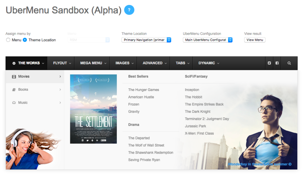
The Sandbox allows you to view UberMenu outside of the confines of your themes. This eliminates many types of Residual…
About Support When you purchase a product from CodeCanyon, it automatically comes with 6 months of support, which begins the…
To manually integrate with Ocean WP and prevent it from interfering on mobile, we'll need to override it's header nav.php…