How to add swipe gesture controls to the ShiftNav Responsive Mobile Menu for WordPress

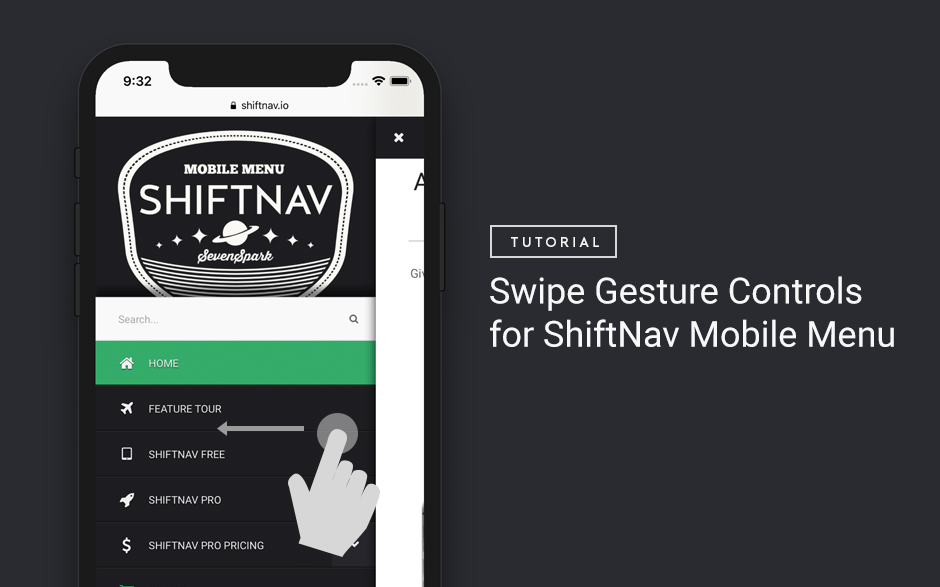
One feature that off-canvas menus sometimes have that ShiftNav does not support out of the box are swipe-to-open and swipe-to-close gestures.


The reason for this is that these touch gestures can very easily cause conflicts with themes, so there isn’t a way to do this 100% reliably for every theme. Moreover, if your site already includes a touch library, it is much more efficient to use that library in conjunction with the ShiftNav Javascript API than to include a separate touch library just for this small piece of functionality.

However, for those who would like to implement swipe gestures to open and close their menu, we provide this tutorial for installing Hammer.js, a really nice touch library, and hooking it up to ShiftNav.

Step 1. Install Hammer.js

First, you need to include the Hammer.js touch library on your site.

Note: you might wonder why include an entire touch library rather than just use native touch events directly? The reason is that touch events are still non-standard across browsers, and Hammer.js helps to unify these into a single, simple-to-use library. You can certainly just use native touch events if that’s what you prefer, but we won’t cover that here.

To keep things simple, we’ll load Hammer.js from github, but you could also install the script on your site and load it there if you prefer.

This code would go in the child theme’s functions.php, or a custom plugin:

function shiftnav_touch_gestures_load_assets(){

  //Enqueue Hammer.js
  wp_enqueue_script( 'hammer-js' ,'https://hammerjs.github.io/dist/hammer.js' , array( 'shiftnav' ), false, true );

}
add_action( 'wp_enqueue_scripts' , 'shiftnav_touch_gestures_load_assets' , 20 );

Step 2. Set up the shiftnav-touch-gestures.js file

2.1 Create the custom Javascript file

In your child theme, create a file called shiftnav-touch-gestures.js

2.2 Load the custom Javascript file

Then, in the child theme’s functions.php, modify the shiftnav_touch_gestures_load_assets() function to also include our new custom file. The complete function looks like this:

function shiftnav_touch_gestures_load_assets(){

  //Enqueue Hammer.js
  wp_enqueue_script( 'hammer-js' ,'https://hammerjs.github.io/dist/hammer.js' , array( 'shiftnav' ), false, true );

  //Get the active theme directory
  $dir = trailingslashit( get_stylesheet_directory_uri() );

  //Enqueue the custom script, which is located in the active theme directory
  wp_enqueue_script( 'shiftnav-touch-gestures-js' , $dir.'shiftnav-touch-gestures.js' , array( 'shiftnav' , 'hammer-js' ) , false , true );

}
add_action( 'wp_enqueue_scripts' , 'shiftnav_touch_gestures_load_assets' , 20 );

Note: if you’re placing the file in a subdirectory of your child theme, or in a custom plugin, adjust the $dir variable assignment as necessary

2.3 Confirm file is properly loaded

To confirm that your new Javascript file is loading on your site, add the following content inside your shiftnav-touch-gestures.js:

console.log( 'Loaded shiftnav-touch-gestures.js' );

Then load your site and open the Developer Tools console and check that the message Loaded shiftnav-touch-gestures.js is printed.

If you don’t see the message in your console, view your source and see if your new Javascript file is being properly loaded. Check the URL and that it is actually pointing to the file you created.

Step 3. Add the touch gesture listeners

Please note, for simplicity we’re going to assume a single ShiftNav instance, aligned to the left of our site. To handle multiple instances or right-aligned menus, you can use this as an example to adapt from.

Now it’s time to write the actual Javascript that will add the swipe gesture detection to our site.

We’ll need to capture two swipe events:

1. A right swipe on the body will open the menu.

2. A left swipe on the menu panel will close the menu.

So let’s set up some scaffolding using Hammer.js in our shiftnav-touch-gestures.js file:

(function($){

   // Swipe Open Hammer Instance
   // -- right swipe anywhere on the site body
   var swipeOpenTarget = document.querySelector( 'body' );
   var openHammer = new Hammer( swipeOpenTarget );
   openHammer.on( 'swiperight' , function( e ){
       console.log( 'open ShiftNav on swipe right' );
   });

   // Swipe Close Hammer Instance
   // -- left swipe on the ShiftNav Panel
   var swipeCloseTarget = document.querySelector( '.shiftnav .shiftnav-inner' );
   var closeHammer = new Hammer( swipeCloseTarget );
   closeHammer.on('swipeleft', function( e ) {
       console.log( 'close ShiftNav on swipe left' );
   });

})(jQuery);

In the above code, we set up two swipe listeners, and when the swipe gesture is detected, a message is printed to the console.

At this point, you can test the code so far by opening the site in Chrome, going to the DevTools and enabling the mobile emulation (to use touch events with your mouse), and then swipe right on the body and left on the ShiftNav Panel and checking the console output.

Step 4. Connect the touch gesture listeners to the ShiftNav API

Now, let’s replace our console.logs with the ShiftNav Javascript API function calls to our code to hook up the ShiftNav open and closing commands to the swipe events.

To open the menu, we’ll use

$( '.shiftnav-shiftnav-main' ).shiftnav( 'openShiftNav' );

To close the menu, we’ll use

$( '.shiftnav-shiftnav-main' ).shiftnav( 'closeShiftNav' );

The final shiftnav-touch-gestures.js file looks like this:

(function($){

  // Swipe Open Hammer Instance
  // -- right swipe anywhere on the site body
  var swipeOpenTarget = document.querySelector( 'body' );
  var openHammer = new Hammer( swipeOpenTarget );
  openHammer.on( 'swiperight' , function( e ){
      $( '.shiftnav-shiftnav-main' ).shiftnav( 'openShiftNav' );
  });

  // Swipe Close Hammer Instance
  // -- left swipe on the ShiftNav Panel
  var swipeCloseTarget = document.querySelector( '.shiftnav-shiftnav-main .shiftnav-inner' );
  var closeHammer = new Hammer( swipeCloseTarget );
  closeHammer.on('swipeleft', function( e ) {
      $( '.shiftnav-shiftnav-main' ).shiftnav( 'closeShiftNav' );
  });

})(jQuery);

And that’s it! Here’s our result:

Caveats

Please note that there are many themes that interfere with touch events such as these, especially the event on the body. If you try this out and it doesn’t work with your theme, that’s likely the issue. This isn’t a 100% foolproof way to implement this, unfortunately, but you may be able to attach the swiperight event elsewhere on your site, or you may need to modify the theme’s Javascript if you need to make this work.

Also note that Javascript touch is still finicky on many devices. We recommend treating swipe gestures as a nice-to-have, but you should not rely on them (make sure there is another way to open and close the menu).

Do please note that this is a customization, and not a supported feature of ShiftNav. While we offer this tutorial in the hope it’ll help you out, please understand this functionality is outside the scope of support.

Some mobile browsers use swiping from the edges of the viewport for other gesture control, and those will supersede the Javascript-based controls above.

UberMenu 3.4 Release Notes

UberMenu 3.4 brings a variety of new features and enhancements to your mega menus. This article will run down the biggest changes and how they’ll affect you moving forward.

Font Awesome 5 Update

The biggest change in UberMenu 3.4 is the update from Font Awesome 4 to Font Awesome 5. Font Awesome 5 introduces new icons, offers SVG icons in addition to font icons, and breaks backwards compatibility with Font Awesome 4 icon classes. We’ve worked hard to make sure the transition to the new icon set is as smooth and painless as possible.

Font Icons vs. SVG Icons

Font Awesome has traditionally been drive by font icons – that is, a special font face which contains icon glyphs, which can be applied via i tags and special Font Awesome classes.

Font Awesome 5 now offers SVG (scalable vector graphics) icons.

UberMenu 3.4 supports both options. It will load Font Awesome as Font Icons by default for maximum compatibility. Learn more about the options.

Converting Icons to Font Awesome 5

In Font Awesome 5, some of the icon classes have changed since Font Awesome 4. That means that if you’ve previously set icons, those classes may no longer be compatible with Font Awesome 5.

Not to worry! UberMenu automatically converts your Font Awesome 4 classes to Font Awesome 5 when necessary. That means the update should be totally transparent, and your previous icon settings should just work.

UberMenu also has a migration system that will find any Font Awesome 4 classes and convert them permanently to Font Awesome 5.

For more information on converting to Font Awesome 5, please see this Knowledgebase article: Converting Font Awesome 4 to Font Awesome 5

New Icons

We’ve added a bunch of new icons from Font Awesome 5 to the core plugin as well!

UberMenu Icons Extension

The Icons Extension has also been updated to use Font Awesome 5 and incorporate all the latest icons. If you are using the Icons Extension, you’ll want to update the Extension at the same time.

Mobile Submenu Indicator Close Button

As a new usability feature, when submenus are opened on mobile, a close button will appear in place of the submenu indicator.

This setting is enabled by default. It can be disabled in the Control Panel if you’d prefer not to have it.

This new feature is intended to supersede the the Submenu Close Buttons that appear in the submenu itself. These will be disabled by default moving forward. Customers who are upgrading will have their previous settings retained. We recommend disabling this setting at this point as it is generally redundant when using the new Submenu Indicator Close Button.

Plugin Compatibility: Menu Image plugin

UberMenu now has the ability to detect and attempt to disable plugins that interfere with it. The first such plugin is the Menu Image plugin (available on the WordPress repository). This plugin changes the markup of UberMenu, and therefore the UberMenu styles no longer apply, completely breaking the menu.

Since this plugin has caused major headaches for customers, UberMenu will now detect the Menu Image plugin and disable its filter to prevent it from interfering. This can be disabled in the Control Panel if necessary.

Note that UberMenu has its own advanced image functionality, so the Menu Image plugin is not necessary anyway.

Scroll To Current Class

UberMenu has the ability to set up a menu item to scroll to a particular hash on a particular page. When setting up multiple links to the same page with multiple ScrollTo destinations, these items will all be highlighted as “current” by default by WordPress when the base URL matches the current page.

UberMenu now disables the current class on items with ScrollTo set on them by default. This can be disabled in the Control Panel > General Settings > Script Configuration > ScrollTo Settings > Automatically Disable Current Item Classes on ScrollTo Items if not desired.

Other updates

These are the major updates in UberMenu 3.4. Additionally, we’ve added minor features like the ability to set column background colors, the ability to show the current tab panel with a single setting, an icon title accessibility setting, various RTL improvements, the ability to nudge icons vertically for precision alignment, a new filter for Dynamic Terms custom content, and more! Check out UberMenu on CodeCanyon for the full changelog.

UberMenu 3.3 Release Notes

UberMenu 3.3 was released on July 10, 2017, with a variety of new feature updates and enhancements.

Tabs Features

Out of the box, when you create a Tabs block, all tab content panels will be sized to the height of the largest panel. This provides the best UX for scenarios where the content in each tab is relatively balanced.

In some cases, the content within the tabs can range widely between tabs – one tab may require only 150px of height, while another may require 500px. By default, all tabs in this tab block will display at 500px height.

With the new Dynamic Tabs Sizing feature, as the tab toggle is activated, the entire tabs block will change height to match the height of the current tab content panel.

Animations can also be enabled or disabled for this setting.

In addition, you can now have static (non-toggle) items in your Tabs panel – useful for headings or separating links in the same column.

Dynamic Items Features

Custom Styles. You can now set custom styles on a group of Dynamic Terms.

Custom Anchor Class. You can now add custom anchor classes to both Dynamic Terms and Dynamic Posts for further customization ability.

Custom Empty Results Message. If you set up a Dynamic Terms or Posts query that may return 0 results, you can now set up a custom message to display to the user in that event.

New Customizer Settings

Top Level Line Height. Adjusting the line height of the top level items is often the simplest way to equalize the heights of items with varying content sizes, assuming all text appears on a single line.

Description Hover Color. Change the color of your description text when the item is hovered.

Tab Toggle Current Background and Font Color. Adjust the colors of the tab toggles when they are current.

Rows

Rows now have independent Submenu Column Divider settings so that each row can be controlled individually.

3.3 also includes a variety of other enhancements and fixes. For the full changelog, visit the UberMenu product page on CodeCanyon.

Questions? Please Submit a Ticket (existing customers) or a Pre Purchase Question (new customers) and we’ll get back to you as soon as possible.

WordPress Plugin Technical Support Engineer

This position has been filled.

SevenSpark is seeking a top-notch technical support engineer with deep WordPress knowledge to provide customer support for the suite of SevenSpark WordPress plugins (mainly, UberMenu, ShiftNav, and Bellows Accordion Menu).

The ideal candidate will have both front- and back-end development skills, as well as customer service and troubleshooting skills. The candidate is looking for a long-term role which will hopefully expand from support-specific to additional roles (potentially development, marketing, etc) in the future.

This position will begin as a contract position requiring about 25-30 hours per week, with the intention of transitioning to a full time position if things go well.

SevenSpark has an excellent reputation for customer support, and the successful candidate will help to continue and expand upon that reputation.

Looking for someone who can start as soon as possible.

Position Details

  • Location: Remote position, but must be available east coast US time (flexible for the right candidate)
  • Time commitment: Start off as contract work ~ 25-30 hours/week
  • If things work out, we’ll look to move to full time (40 hrs/week)
  • Opportunity for advancement and to play a significant role in the company in the future for the right person
  • Start date: as soon as possible

Role & Responsibilities

  • Support hours are 9am – 5pm ET (Boston/New York) – generally this means checking in 3 times a day (9, 1, 5), and clearing the queue. These may be somewhat flexible for the right candidate.
  • Support is provided via an email-based ticketing system (HelpScout)
  • Support includes answering any and all customer support inquiries as well as pre-purchase questions. Minor CSS customizations. Providing best practice advice. Doing manual integrations when necessary ( basic PHP editing ).
  • Future role may be expanded to include documentation, product development, testing, or marketing, depending on candidate’s desires, experience, and aptitude.

Requirements

The main focus of this position is customer support and troubleshooting customer issues with WordPress plugins. In general, you should have a strong understanding of both the backend and front end of WordPress development, and the confidence to troubleshoot any issue that arises.

Of course, there will be guidance and instruction available (you don’t need to know everything at the beginning), and the developer/founder will be available to answer/troubleshoot any questions beyond your expertise. But the goal is for the support engineer to be able to handle at least 95% of support inquiries, handing the more complex ones off to the developer.

Required skills:

  • WordPress (at least advanced, if not expert. You are confident using the Codex and searching the core when necessary to fill any knowledge gaps.)
  • CSS (advanced – no CSS task should daunt you)
  • PHP (at least intermediate-level)
  • Javascript & jQuery (basic level of comfort and troubleshooting skills, though you’d rarely need to write any)
  • WordPress Theme Customization (knowledge of template structure, general theming, child themes)
  • Comfortable in Chrome Developer Tools (mainly for troubleshooting CSS, JS, and network issues)
  • Ability to run local test installs
  • Self-starter, motivated & fast learner
  • Excellent customer service skills
  • Polite, patient, helpful, even with impolite customers
  • Eager to help customers
  • Fluent written English, excellent communication skills
  • Troubleshooting (you understand how to develop a strategy to troubleshoot/debug a problem)
  • Debugging
  • Responsible & Reliable

Bonus Points

  • Technical knowledge of the WordPress menu system (at least a basic understanding, but any experience here is helpful)
  • Prior customer service experience
  • You’ve coded a plugin or theme
  • ReactJS knowledge
  • Fluency in additional languages

Benefits

  • Remote position – work from anywhere
  • Competitive compensation
  • Some flexibility in hours – while there are certain windows you’ll need to hit, there is a good amount of flexibility in how you can structure your day
  • Potential to expand into a plugin development role
  • Work for an established company with over 100,000 paying customers and 250,000+ users
  • Small company means you have room to grow and make your mark

Who is SevenSpark?

Currently SevenSpark is a one man shop, with multiple successful WordPress plugins. I’m looking to expand the team, which means you have the potential to be an integral part of the future of an already successful company. In the short term, I’m looking for someone who can take over day-to-day operations so I can focus on new projects. In the long-term, I hope to find a productive team member who will play a significant role in the future of the company.

Transition

I don’t intend to throw you in the deep end, but I do expect you to hit the ground running and learn quickly. We’ll work together at the beginning to make sure that you understand what needs to be done and how to approach different tickets. I hope to have you handling the majority of support tickets in the next month or two.

How To Apply

Application period is now closed. Thanks to everyone who applied! Applications are currently being reviewed

Before applying, please be sure to read this job description carefully. Applicants who have clearly not read the job description or do not meet the requirements will not be considered.

Please email jobs AT sevenspark.com with the subject: WordPress Technical Support Position

Please provide the following details in your email by copy/pasting these prompts and filling them out:

Your Name:
Your Location & Time Zone:
Links to your resume or LinkedIn page:
Link to your website:
Link to relevant previous work:

Have you coded a plugin or theme? If so, please provide relevant links

Please briefly describe your previous experience and level of expertise with the following:

  • PHP
  • CSS
  • Javascript, jQuery
  • WordPress use
  • WordPress development
  • Local development environments
  • WordPress menu system
  • Chrome Developer Tools
  • Troubleshooting

Have you provided technical product support before? If so, please describe and send any relevant links. If you would like, please provide email addresses of previous employers as references.

What is your availability/when would you be able to start?

What is your hourly rate?

Please briefly describe why you’d like to work with SevenSpark and how that can help you achieve your goals.

Finally, please briefly describe why you think you are a good fit for the position, and include anything else you’d like me to know.

Thanks for applying!

UberMenu Extensions now available exclusively through sevenspark.com

Back in September, Envato enabled “Author Driven Pricing” for WordPress products on CodeCanyon. Coupled with this change, Envato changed their pricing policy adding a new fixed buyer fee. As a result, for inexpensive items like UberMenu extensions, Envato was taking over 70% of the revenue from each sale.

The long and the short of it is that with these new fees, selling inexpensive extensions on Envato is no longer economically viable.

Envato’s suggested solution is to raise prices (now that authors have control over this) to maintain the 70% share after factoring in the fixed fee. However, this would have meant a significant increase and extra burden on customers in order to make continuing to sell on Envato worthwhile.

Instead, UberMenu extensions – UberMenu Sticky Extension, UberMenu Icons Extension, UberMenu Conditionals Extension, and the UberMenu Flat Skins Pack – will now be sold on sevenspark.com. This way prices can remain low for customers, and it’s still economical to sell them inexpensively.

What about UberMenu core?

The core UberMenu plugin is still for sale through CodeCanyon. While Envato is taking slightly more of a cut than they used to, I feel that this is still the best place to provide UberMenu to customers.

What does this mean for new customers?

For new customers, you can now purchase UberMenu Extensions directly from sevenspark.com. All 4 extensions are still available at their most recent price from Envato.

What does this mean for existing customers?

If you are an existing customer who has purchased an UberMenu extension, don’t worry. The extensions are still maintained, your license code is still valid, you will still receive updates (through the WordPress admin), and any support packages purchased with the extensions will be honored.

In short, nothing has changed with your existing purchase, there’s just a new home for the product.

How do I get updates?

Updates will be delivered through the WordPress update system. Just enter your extension license codes in the UberMenu Control Panel > Updates tab.

Note that you will need to be running UberMenu 3.2.6 or later to be able to see these settings.

Do you need fresh download links for the extension files? Please visit the Download Link Generator. You’ll need your purchase codes from CodeCanyon to generate the links.

What if I need more support for an item purchased on Envato and my support has expired?

If you purchased your Extension license through Envato, you’ll no longer be able to renew support there, since the item has been removed. (Note that you can still Submit a Ticket with your existing license and receive support for any remaining support period you have already purchased).

Instead, you can now purchase a license through sevenspark.com, and this will provide a year of support. For comparison, the $8 plugin on CodeCanyon would have cost $7 for 6 additional months of support ($1.16/month) after the support period expired. Your purchase through sevenspark.com will cost $8, but will provide you with an entire year of support rather than just 6 months ($0.67/month). That support can optionally be renewed yearly at an additional 30% discount.

Questions, concerns?

Questions or concerns? Please Submit a Ticket and we’ll get back to you.

An added bonus!

As an added bonus, we’re now able to sell a discounted bundle of all 4 current UberMenu Extensions – save big when purchasing them altogether here: UberMenu Extensions Bundle

Introducing Bellows Accordion Menu for WordPress

WordPress Accordion Menu Demo

One of the most frequent requests I get from customers is how to create an accordion menu on their WordPress sites. Having researched the few existing options, and not feeling comfortable recommending any of these to my customers, I set out to create a smart, robust, flexible, and modern accordion menu plugin for WordPress.

Introducing Bellows

I’m very pleased to announce the release of the new Bellows Accordion Menu plugin for WordPress. Bellows is the culmination of almost a year of development and beta testing to produce a slick and easy to use accordion navigation solution.

Bellows comes in two flavors – Bellows Pro and Bellows Lite.

Bellows Lite – Accordion Menu is available on the WordPress plugin repository for free. It’s a fully functional standard accordion menu. The menu structure is built in the standard WordPress Appearance > Menus screen. It includes 3 skin presets, supports multiple submenu levels, multiple- or single-folding of submenus, automatic expansion of current submenus, and integration via either shortcode or widget.

Bellows Lite Accordion Menu for WordPress

Bellows Pro – Accordion Menu works on the same foundation as Bellows lite, and adds a variety of extra features that make the plugin very flexible and dynamic. These include:

  • Over 20 Skins
  • Style customizations via the Customizer, a well as individual menu item styles
  • Icons and images within menu items
  • Widgets and custom content within menu items
  • Ability to automatically generate the accordion menu contents based on post or taxonomy term hierarchy

Bellows Pro Accordion Menu

If you’re curious about the full feature set and want to see how Bellows works, check out the Bellows WordPress Accordion Menu demo site

Menu Generator UI

One of the features I’m most excited about is the Menu Generator UI. This feature gives the user the ability to quickly configure complex query filters to generate automatically populated menus, and preview the results in real time. The user simply checks the filters/parameters they wish to use to produce their menu results, and the interface provides a preview and the appropriate shortcode to be used. This feature gives users a lot of power to create the menu they want without needing any coding skills.

Auto-generating accordion menus with Bellows

Moreover, the menu can be made dynamic relative to the current page. The auto-populated menu can inherit the current page as a parent, and can therefore dynamically change based on the currently viewed page. So a single menu could be used across the site to produce a hierarchical menu specific to that page, with minimal configuration.

Menu queries can also be saved and reconfigured at a later time, so that when a change needs to be made, it can be made in one location and propagate across the entire site.

Beyond just menu items

While accordions are great for standard navigation lists, Bellows also allows the insertion of any type of HTML, shortcode, or widget content. This means there are effectively no limits to the type of content that can be added within the accordion. Add images, icons, contact forms, third party content feeds, maps, and more!

Multiple Configurations

Bellows Pro’s Configuration system makes it easy to both configure separate menus independently, as well as re-use your settings across menus when desired. Create multiple configurations and apply them to your various menus as desired to control the look and feel of each accordion instance individually.

Why an accordion menu?

Accordion menus are pretty simple beasts. The menu has a hierarchical structure, and when a parent item is activated, its child items appear below it. Their usefulness is in the extremely clean hierarchical display that allows the user to explore a list of items. It’s a very common UI paradigm, seen in all sorts of interfaces. In fact, it’s become more common on mobile interfaces where content tends to stack vertically due to lack of horizontal screen real estate.

The real value in accordion menus is providing contextual content. They tend to be used as secondary navigation systems, and as such, may change from page to page. This is why the flexibility and dynamism of Bellows is so powerful, as it can be placed just about anywhere and display content based on the current page. Allowing the user to explore within the current context saves time and energy, helping them find the content they’re looking for more efficiently.

Complementing Ubermenu

One mistake I see UberMenu customers make is trying to add too much content to their primary navigation. A site’s primary navigation should generally have no more than 3 hierarchical levels, and less than 100 items. When well organized, this keeps the menu structure easily digestible by site visitors. But when a site has many levels of taxonomical terms or posts, it can be tempting to try to cram all of this structure into the primary navigation. Unfortunately, this often leads to an unusable menu, with so many items that visitors can’t actually find what they’re looking for, defeating the purpose of the navigation in the first place.

The solution is to have section-specific secondary menus on the site, which allow users to drill down further into the site contents within a given context. This is one thing that Bellows will help customers with large sites a lot – first, navigate to a section of the site using the main menu; then drill down within that section using an accordion menu in the sidebar. Bellows Pro’s dynamic menu content population can make this much easier to achieve.

Have you checked out the demo?

I’m really excited to release Bellows, and I really hope you enjoy it! Check out the Bellows demo for more information. Questions? Ask away by clicking the “Questions” button here: Bellows Pro

ShiftNav 1.5 is here!

ShiftNav v1.5 was just released! This is a feature release, with a variety of new features and enhancements. Listed below are the biggest new features of the plugin for this version. Enjoy!


Hamburger-only button toggle

One of the most requested features for ShiftNav was to simplify the default full-width toggle bar into a simple hamburger button.  While it’s always been possible to do this by disabling the main toggle bar and adding a simple custom toggle to the site, v1.5 now includes this as an option in the settings.  Now it’s easy to have a simple hamburger toggle that sits on top of the site content on mobile.


UberMenu Menu Segment Processing

Many customers enjoy making use of both UberMenu and ShiftNav in tandem.  While in most cases, maintaining a separate, streamlined menu for mobile users is best practice, sometimes it’s useful to be able to re-use the same menu structure for both UberMenu and ShiftNav.  Therefore ShiftNav will now process UberMenu Menu Segments, a useful tool for breaking WordPress menus down into more manageable segments.


Icon Enhancements

ShiftNav Pro now provides further flexibility when it comes to applying icons to your ShiftNav menu items.

The Disable Text setting allows users to set up icon-only menu items. And the Custom Icon Class setting allows users to use custom icon sets that are already loaded on their site without having to write any custom code.


Login/Logout shortcodes

ShiftNav Pro 1.5 now includes two new shortcodes that are useful for customers that have a registered user base.

The login and logout shortcodes are a set of easy to use shortcodes that provide a link to the login page, and a logout link, respectively, in the toggle bar.

The icon and content of the links are configurable in the shortcode settings.

 
Check out the full changelog on the ShiftNav Pro product page

UberMenu 3.2.2 Release Notes

UberMenu 3.2.2 was released on December 8, 2015. This was a minor feature update release.

Questions about updating? Check out the Update FAQs and be sure to follow the Installing Updates guide

Responsive Images

The most interesting new feature with UberMenu 3.2.2 is support for WordPress’s new Responsive Images functionality. This means that when you upload an image for UberMenu, those images will automatically get the srcset and sizes attributes so that compatible browsers will pull the most appropriate size image from the server.

The upshot is that you’ll save bandwidth for mobile users, and get higher resolution images for your users with larger screens.

Automatic Updates (beta)

Automatic update capability shipped with 3.2.1, but with this update it’s the first time users will actually be able to test this functionality. The feature is disabled by default, but to enable it for beta testing you can set a constant in the wp-config.php. Check out Automatic Updates (Beta) for more details.

New Settings

A variety of new settings were added to give additional control when configuring the menu, including a submenu minimum height, disabling UberMenu when mobile devices are detected, disabling top level item dividers, and automatically collapsing the mobile menu after following a ScrollTo link.

WordPress 4.4 Updates

WordPress 4.4 changed some admin screen styles, so UberMenu 3.2.2 has been updated to work with these new admin styles and set the appropriate header tags. The new nav_menu_items_arg filter has also been added, though it is disabled by default and can be enabled by setting UBERMENU_ALLOW_NAV_MENU_ITEM_ARGS_FILTER to true in wp-config.php

Enhancements & Fixes

A variety of tweaks have also been made to improve user experience. The sensor parameter has been removed from the Google Maps API as it is no longer required. Font Awesome has been update to the latest release, 4.5.0. If settings fail to load in the Menus Panel due to interference from a theme or another plugin, the settings panel output and/or console will attempt to display helpful troubleshooting messages for the user.

A few minor bugs have also been squashed, including a clipping issue with multi-level left-expanding flyout submenus, and submenu overlap on mobile with vertical-oriented menus with flyout submenus in particular positions.

New features in UberMenu 3.2.1 update

UberMenu 3.2.1 was released today – here’s a quick rundown of some of the new features.

Have questions about updating?

Submenu Column Dividers

You can now add visual dividers (borders) to your submenu columns via a setting in the UberMenu menu item settings.

You can set the divider color as well as a minimum column height, which keeps heights even.

Submenu Auto-Columns for static items

With most mega menus, second level items become column headers in the submenu, and third level items fill the columns vertically below those headers, as shown here:

If you only use second level items, they will organize from left to right, then wrap to the next line.

If you effectively only have two levels of menu items – meaning there are no column headers – but want the items to organize in columns from top to bottom, you can use the special Columns menu items to organize your items into submenu columns manually.

With the new Submenu Automatic Columns feature in UberMenu 3.2.1, you can automatically divide your second level items into columns organized top to bottom, rather than left to right, without manually adding Column items. Just set the number of columns you want to create for that submenu, and UberMenu will automatically divide up the item’s child items into evenly distributed, even-width columns.

If you need more fine-grain control, you can still use the Column items, of course.

If you are using Menu Segments, you can now cache the output of the menu segment as HTML, stored as a transient in the database. This can mean a substantial processing savings, as this caching can mean running one query per submenu rather than dozens to process each menu item individually.

You can enable and disable caching on each menu segment, as well as set the expiration time, or how frequently the segment should be regenerated.

This feature is very similar to the WP Menu Cache plugin (so if you are using that plugin, you don’t need this feature), however it is simpler – there’s less concern about caching per page or per user, since you’d generally only be using menu segments in submenus. But do keep in mind that if your content varies on any axis (page/user/etc), you should not enable caching.

For Developers

Mobile toggle events

UberMenu 3.2.1 adds two new Javascript API events, ubermenutoggledopen and ubermenutoggledclose. These events fire on when the mobile menu is toggled opened and closed so that developers can trigger their own callbacks at these points.

Menu Item Image filters

There are now 3 new image filters, which allow greater control over automatically setting the image for specific items. This can be useful if you want to programmatically assign images other than Feature Images to a menu item that aren’t standard Core features – such as WooCommerce product images, for example. More info: Knowledgebase: Image filters

Dynamic Post Items Title filter

The ubermenu_dp_title filter allows you to alter the title of the posts returned by the Dynamic Posts items, for example to trim the length of the post titles.

Enhancements

A few enhancements were made as well.

Mobile Scrolling – You can now scroll the page on a mobile device without closing the submenus even with touch-off close enabled.

Fonts – There’s a new setting to set the Font Family specifically for the menu (without loading a Google Font), and Google Fonts are now sorted alphabetically rather than by popularity so they can be located more easily.

Improved WPML Compatbility – In some instances, WPML passes a non-standard value to an argument in the wp_nav_menu() parameters, which can throw an error. UberMenu now handles this scenario.

Improved Mobile Tabs – Tab toggles can now close their submenus when tapped on mobile, provided they have their links disabled. This makes it easier to open and close tabs on mobile devices. Tabs also now automatically collapse when the browser is resized to mobile sizes.

Extensions

Please note that the Icons Extension has also been updated to version 3.2.1, and now includes the new icons from Font Awesome 4.4. If you are using the extension, you can update this plugin separately in the same fashion if you would like to use the new icons.

Questions about updating?

To update to UberMenu 3.2.1, please follow the standard instructions in the Knowledgebase: Installing Updates

Updating FAQs

Will I lose my settings when updating?

No, your settings are stored in the database; only the files in the plugins/ubermenu directory will be replaced. You should never edit the UberMenu plugins files, so this should not be an issue. If you have added files in the /custom directory, they should automatically be backed up and restored after updating if your installation is running properly, but taking a backup of the /custom directory is a good idea just in case.

Of course, you should always back up your site before running any sort of update so that you can revert in case something goes wrong.

If you are updating from UberMenu version 2, please be sure to read and follow the UberMenu 2 to UberMenu 3 Migration Guide

Where can I download the update?

If you are an UberMenu customer, you can download the latest version of UberMenu from your CodeCanyon Downloads page. Otherwise, you can purchase UberMenu through CodeCanyon

Automatic Updates aren’t working, I get an error trying to update

There are no automatic updates. Please review the update notes and notices in your admin interface. To install the update, you’ll need to download the zip from CodeCanyon and update the plugin manually. Please see the instructions here: Installing Updates

Is the update free?

Yes, if you have purchased the plugin you can get the latest version via your CodeCanyon Downloads page

Any further questions?

If you have any questions not answered here or in the Knowledgebase, please Submit a Ticket

Help a dev out! When asking for support: ALWAYS include a URL

So, something isn’t working on your website, and you need an expert to tell you what’s wrong. To get the best support possible, you need to allow them to view your website so they can investigate.

I frequently receive support requests from customers asking me to diagnose issues based on just a description or a screenshot. As someone who deals with troubleshooting customer site issues a lot, I can tell you that access to the site itself is almost always a prerequisite to providing assistance. While it seems obvious to a developer that this is a necessity, it doesn’t occur to some customers, so I thought I’d explain why access to the actual site is so critical when troubleshooting.

Vague symptom reports and screenshots don’t tell the whole story

Unfortunately, customer reports of site issues are rarely reliable, simply due to lack of expertise. Just like I can’t give a mechanic a useful diagnosis of issues with my carburetor, non-developer analyses of website issues are similarly unhelpful (or at least incomplete) for troubleshooting the problem (customers with the skills to provide a complete analysis have already solved their own problem in 99% of cases). In the best case, the report is but one piece of the puzzle; in the worst case, the report is misleading as the user has misinterpreted the issue (that’s not a z-index issue, it’s a hidden overflow problem).

Screenshots are little better for troubleshooting – though they can certainly be useful in drawing attention to the location of the problem. The visual output of an issue is only a small fraction of the information available to an expert attempting to diagnose a problem. In my experience, guessing based on a screenshot is essentially pointless.

Analogy time.

Accessing your site in a browser is like getting under the hood of your car

Car troubleshooting

When you’ve got automobile problems, you need to bring your car into the shop. They can run diagnostics, test the battery, check the oil level, and see the engine firsthand. In short, the mechanic needs to get under the hood to investigate the source of the problem.

The same thing is true with websites. The customer only sees the symptoms on the surface – the end result. The developer, with specific browser tools, can look at the underlying HTML, CSS, JS, and DOM structure, view javascript error logs, investigate the loading of resources over the network, troubleshoot CSS selector specificities, debug javascript execution, and even test solutions.

Firsthand access to the website is absolutely critical to the accurate diagnosis of any non-trivial site issue.

Luckily, providing access to a website is a lot cheaper than a tow truck.

Just the tip of the iceberg

Keep in mind that symptoms and diagnoses are not 1:1 relationships. There could be multiple causes for the same symptom, so a developer can rarely offer a definitive solution based on a symptom report alone. For example, let’s say a custom CSS style isn’t working on a website (a common support request: “I added some CSS but it didn’t work – why?”). Here’s a partial list of why that might occur:

  1. The stylesheet didn’t load (this in and of itself could have several different causes)
  2. The stylesheet loaded, but a syntax error prior to the style in question prevented the style from being processed by the browser
  3. The custom CSS selector did not properly target the intended element
  4. The custom CSS selector targeted the element properly, but did not have a high enough specificity and was overridden by another style.
  5. The custom CSS was properly applied but was missing the prefix for the desired browser.
  6. A caching plugin is in use and the cache was not cleared, so the site is still serving up old stylesheets without the new custom CSS
  7. An HTML syntax error caused a DOM error that prevents style rendering in Internet Explorer
  8. A bad doctype has sent IE into quirks mode, altering the rendering of the DOM elements

A single symptom might be the indicator for a number of underlying causes

A report that “the CSS doesn’t work” or a screenshot showing a lack of styling gets us no closer to a resolution because it gives us no information to troubleshoot. As soon as the URL is provided and the developer can get “under the hood,” the cause behind the symptom can be diagnosed, and a solution can be provided.

Imagine calling your mechanic and saying “my car won’t start, what is wrong?”

Well,

  1. Your battery might be dead
  2. The spark plugs might be worn out
  3. The ignition timing might be off
  4. The distributor cap might be cracked
  5. The car might be out of gas
  6. Maybe the engine is flooded from that time you drove through that puddle the size of Lake Michigan
  7. Maybe you didn’t turn the key or have your foot on the break when you pressed the keyless ignition start button

(or probably 50 other reasons – I’m not a mechanic, and I don’t play one on TV)

You’ll need to bring it into the shop, because your mechanic can’t tell the source of the issue without looking under the hood. Neither can your web developer.

But I’m still in development!

So, what do you do if your site isn’t public, so your expert/developer can’t see it? You have a few options:

1. Try to debug it yourself with the resources at your disposal. In the case of UberMenu for example, I’ve provided a Troubleshooter that will walk you through troubleshooting common symptoms.

2. If your site is on a public server but requires credentials, provide credentials to the expert troubleshooting your site.

3. If your site is not on a public server, and you don’t know how to troubleshoot it yourself, you’ll either need to hire someone to come over and view the site on your local network, or put the site up on a public server temporarily so the expert can troubleshoot it remotely. I recommend the latter.

4. If it’s a code problem that isn’t site-specific, create a demonstration of the issue that others can troubleshoot. CodePen and JS Fiddle are excellent resources. As CodePen states: Demo or it didn’t happen.

Demo or it didn’t happen


If you want help from a developer, it’s up to you to provide the requisite access. Your doctor needs to X-ray your arm to see if it’s broken, your mechanic needs to check your car’s oil to tell if it needs replacing, and web developers need to see your website in a browser in order to troubleshoot it. Expecting a developer to be able to diagnose and provide a solution for a problem that they can’t investigate simply isn’t reasonable.

Want good support? The most important thing to do is to make it as easy as possible for the developer to troubleshoot your site by providing them all the resources they need. That and be polite – the friendly customer is going to get a better response than the belligerent customer any day of the week 🙂

Happy troubleshooting!