
Setting the Panel Width via the Control Panel settings
Appearance > ShiftNav > Main ShiftNav Settings > Panel Width
Since v1.8.2, you can set the panel width via the Control Panel.
You can use this setting to set the width to any valid CSS width value. By default a clamp function is used to make the panel work well at any viewport width. See the section below on how the default value is set.
Individual Panel Settings
Out of the box, all panels will use the same default width.
The Control Panel setting will set the value for a specific ShiftNav panel instance, which allows each of your panels to have different widths.
If you want to customize the panel width and set it globally, using the CSS variable below is the most efficient option.
Setting the Panel Width via CSS variable
Since v1.8, ShiftNav supports setting the panel width via the CSS variable --shiftnav-panel-width.
The panel width can be controlled by setting the variable in your CSS Tweaks.
/* Setting the panel width to a static value */
body{
  --shiftnav-panel-width: 320px;
}
Default Panel Width Value
The default panel width value provides a fluid panel width to maximize the menu’s responsiveness.
:root{
    --shiftnav-panel-width: clamp(min(290px,calc(100vw - 48px)), min(calc(100vw - 48px), 600px), 100vw);
}
This clamp function essentially says that the browser should render the panel width as:
- Ideally, 48px less than the viewport width (leaving space for the toggle), but no more than 600px
- At a minimum of 290px or 48px less than the viewport width, whichever is smaller
- At a maximum of the full viewport width
It’s recommended that if you want to adjust this, you also use a clamp function to define how the panel should be sized based on the viewport width.
How to make the panel full width
This is the most likely use case for this variable.
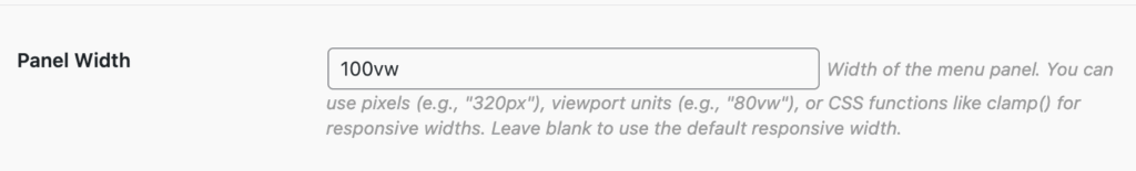
Control Panel Setting
Use this value in the Control Panel Setting
100vw
CSS Variable
body{
  --shiftnav-panel-width:100vw;
}
If you make the panel full width, remember to switch on the close button within the panel so that the user can close the panel after opening it.
How to make the panel a static width
If you’d like to disable the fluid menu width, you can set a static width, for example, 320px:
/* Setting the panel width to a static value */
body{
  --shiftnav-panel-width: 320px;
}
However, given that you don’t know what size device the user is viewing your site on, it’s still likely a good idea to use a clamp function:
Control Panel Setting
clamp(200px, 320px, 100vw)
CSS Value
/* Define a preferred static value, but use a clamp function for better device support */
body{
  --shiftnav-panel-width: clamp(200px, 320px, 100vw);
}
How to make the panel a relative width
If you’d like to make the panel always a specific percentage of the viewport, you likely want to use vw units. For example, making the panel 80% of the viewport:
Control Panel Setting
80vw
CSS Variable
body{
  --shiftnav-panel-width:80vw;
}
Again, a clamp function is advisable here. You probably never want the menu to be below a certain width for usability, or above a certain absolute pixel value on wider screens
Control Panel Setting – Clamp
clamp(300px, 80vw, 500px);
CSS Variable – Clamp
body{
  --shiftnav-panel-width:clamp(300px, 80vw, 500px);
}