
It’s critical to understand how menu structures created in the Appearance > Menus screen map to UberMenu Layouts. Here’s a diagram showing how first, second, and third level menu items are organized into a mega menu layout.
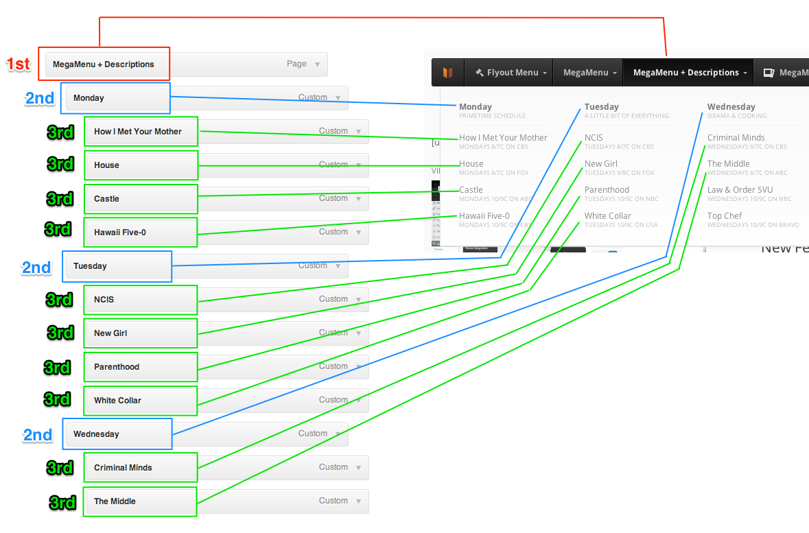
Top (First) Level Menu Items
Laid out horizontally, left to right. Always visible on the menu bar.
For a horizontally-aligned menu, the top level menu items are listed in the row of main links in the navigation menu. For a
vertically-aligned menu, these items are aligned in a column. The top level menu items are always visible.
Examples of Top Level Menu Items: Flyout Menu | Mega Menu | Mega Menu + Descriptions
Second Level Menu Items (Column Headers)
Laid out horizontally, left to right, within a submenu. Act as submenu Column Headers.
The second level menu items (those that are indented once below top level menu items) are treated as headers within the
sub menus. They contain third level menu items to for sub menu groups. These groups are aligned as columns within the sub menu,
with the second level menu items as the headers at the top of each column.
Example of Second Level Menu Items, sub-menu of MegaMenu + Descriptions: Monday | Tuesday | Wednesday
Third Level Menu Items and Below
Laid out vertically, top to bottom. Listed below their second level item header.
All menu items deeper than level 3 are treated as level 3 menu items. These items are the content links within their parent
categories. Sibling items are aligned vertically in list-fashion below their column headers (second level menu items).
Example of Third Level Menu Items, under Mega Menu + Descriptions > Monday: How I Met Your Mother | House | Castle