
With some themes, UberMenu may replace only the theme’s responsive or mobile menu, but the main menu remains unchanged. This happens when the theme calls wp_nav_menu twice with the same theme_location. As a result, UberMenu is only applied to the first instance of the theme location, and if the mobile menu is printed first by the theme, only the mobile menu will be affected.
Any changes you make to your theme should be done in a child theme. Generally this just means copying over the header.php and modifying it accordingly. Many themes already include a starter child theme for you.
Note that if you just want to use UberMenu as both your main and mobile menu, simply remove the wp_nav_menu call for the mobile menu. UberMenu only needs one instance to be responsive.
If you want to maintain your theme’s mobile/responsive menu but use UberMenu as your main menu, the solution is to separate these two menus with two different theme locations.
Changing the Theme Location Instance (UberMenu 2.4.0.1)
As of UberMenu v2.4.0.1, UberMenu offers a “Theme Location Instance” setting, so you can tell UberMenu to target the second instance of a theme location rather than the first. So if UberMenu is replacing your mobile menu, but you want it to replace your desktop menu, try changing this value to 2 in your Advanced Settings

For many cases, this will be all you need to do. However, in certain cases you may need to separate the theme locations manually. Proceed to the next section if this doesn’t work, for example:
- If you are using multiple UberMenus, this instance value will apply to all of them; so if some of your theme locations need instance 1 and others need instance 2, you’ll need to sort that out via templates (as shown below) rather than this setting.
- If your theme has residual styling (see also: residual styling troubleshooting guide), you’ll still need to edit the template file to remove the residual styling from around the desktop menu.
- If you want to use UberMenu as your mobile menu, you’ll still need to remove the mobile menu from your theme template
Separating theme locations in the theme
1. Register a new theme location by adding this code to your child theme’s functions.php
register_nav_menu( 'mobile-menu' , 'Mobile Menu' );
This will register a new theme location called “Mobile Menu”, which will appear in your Menus Panel.
2. Copy your header.php (or whichever template file contains your mobile menu) into your child theme.
3. In your child theme, (usually in the header.php) change the theme_location parameter in the mobile menu’s wp_nav_menu call to 'mobile-menu'
wp_nav_menu( array(
  'theme_location' => 'mobile-menu'
  /* other settings */
) );
3. Go back to your Manage Locations Panel, under Appearance > Menus > Manage Locations (tab), and assign your main menu to the Mobile Menu theme location.
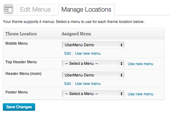
You will now have UberMenu as your main header menu, and the theme’s menu as the mobile menu.
Things to keep in mind:
- Do not activate UberMenu on the Mobile Menu location
- Your mobile menu will not be an UberMenu, so any UberMenu-specific menu items or features (images, icons, widgets, colors, styles, etc) won’t affect the mobile menu
- You may still have residual styling (see also: residual styling troubleshooting guide) on your main menu, depending on how modularly the theme was coded
- You can assign any menu you want to the mobile menu, it doesn’t have to be the same as the one you use for UberMenu
- If both the UberMenu and the mobile menu show at mobile sizes, you will need to add a media query to hide the UberMenu, similar to this:
@media only screen and (max-width: 959px){
 #megaMenu{ display: none !important; }
}
Adjust the breakpoint as necessary for your theme.