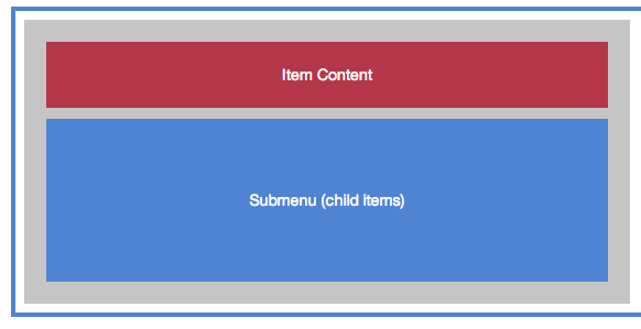
To visualize a menu item layout, imagine a box which contains two things:
1. Menu Item Content (the link, image, description, icon, etc)
2. Any child items (the submenu)
Check out the Visual Layouts Guide
There are two parts to configuring the layout of a menu item:
1. Grid Layout – setting the Grid Columns for a menu item determines how wide the “box” is, and how much its container it occupies.
2. Item Content Layout – the Item Content Layout determines how the content elements inside the “box” are laid out.
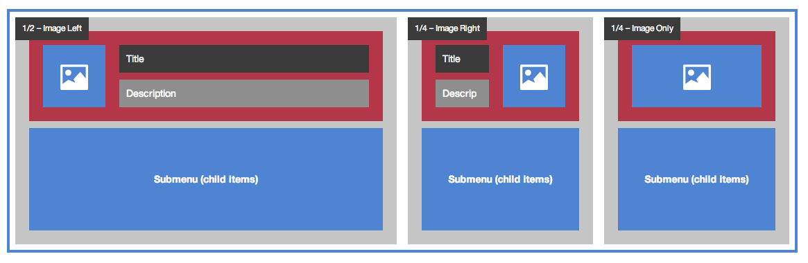
Grid Layout
The grid layout controls the width of the menu item “box” relative to its container (generally the submenu). A default Grid Column can be set by a parent menu item in the submenu settings, and this can be overridden by each individual item in the Menu Item Settings > Layout > Columns Width

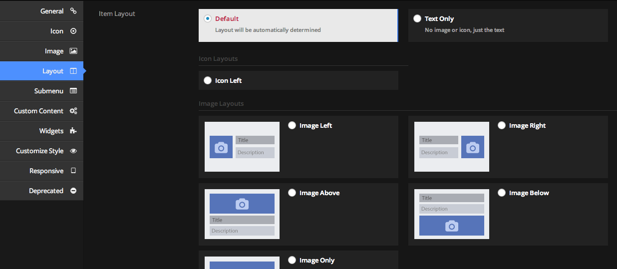
Item Content Layout
The layout of the contents of the menu item has to do width how the various elements – icon, image, title, description, etc, are laid out within the “box”.
This can be controlled in the Menu Item Settings > Layout > Item Layout
Item Content Alignment
You can adjust the alignment of the content (text, image, etc) within the menu item left, right, or center, by using the Item Content Alignment setting.


Note that in the above image, the image positions don’t change – that’s because the images are the full width of the menu item, so no matter where they are aligned, they occupy the same space. If the item were wider (for example, because the column was set wider than the image width), the image would also be aligned left, right, or center with the text
Submenu layout
For information on controlling the submenu layout (this is the layout of the items relative to one another, as opposed to the layout of the content within an individual menu item), see Submenu Layouts
Visual Demonstration
For a visual overview, please view the Visual Layouts Guide